Welcome back to our series on creating custom blocks with the WordPress Gutenberg Block API. This tutorial is all about extending the random image block we created in the previous post. We got as far as adding a drop-down control to select an image category. We’ll continue with this by adding more block options to allow further customization.
Specifically, we’ll see how to add block settings in various parts of the editor. That’s right, you’re not just limited to adding block controls directly on the block itself!
The final my-custom-block plugin code is available to download. Just click the link in the sidebar to the right and download the zip file to your computer, and install it as you would any other WordPress plugin. You can also find the source code in our GitHub repo.
Gutenberg development is cracking on at a fair pace, and there’s been a new significant release since the last tutorial was published. The version of Gutenberg used in this tutorial has been updated to 3.0.1, and some of the editor UI may look slightly different from screenshots shown in previous tutorials in this series.
Let’s Extend!
The drop-down control we added in the previous tutorial was located inside the editor, directly underneath the markup for the random image. This was convenient, but we have other choices too.
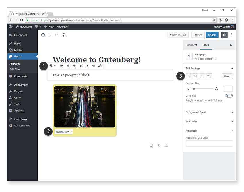
We can also add block controls to a pop-up toolbar (which appears when a block is selected) and a block inspector panel.

In the screenshot above, we can see the toolbar controls for the paragraph block [1], as well as the associated controls in the panel inspector [3]. Location [2] shows the drop-down control for our random image block.
You might already be thinking about which location you’d choose for your own block settings, but you don’t have to choose just one of these locations. They aren’t mutually exclusive. For example, for the paragraph block (shown above), you can see that the settings are split between the block inspector panel and the toolbar.
Furthermore, it’s perfectly OK to have two separate controls in different locations in the editor that affect the same setting. You might not want to do this too often, but it’s useful to know how to implement it, so we’ll see how to do this a little later on.
Direct Block Settings
Let’s start with the easiest way to add functionality to your block, which is directly inside the block’s edit function. We’ve already used this approach to add our random image drop-down control because it requires very little extra effort.
We won’t go over adding new controls to the block itself, but we can tweak the behavior of the drop-down control to be a bit more intuitive. To make it render as close as possible to the front end, we can restrict the drop-down from appearing unless the block is selected.
Let’s make this change now. If you’re following this tutorial from last time then open up /my-custom-block/src/random-image/index.js in your favorite editor. This is the main JavaScript file for our random image block.
One of the props passed to all blocks is isSelected, which holds the status of the block’s visibility. We can use this to conditionally display the category drop-down control.
Firstly, pull out isSelected from the props object and add it to the list of constants inside the edit function. This is useful so we can reference it by a shortened name (i.e. isSelected rather than props.isSelected).
const { attributes: { category }, setAttributes, isSelected } = props;
Next, we can use this property to determine if the drop-down control should be displayed:
{ isSelected && (
) }
This is a shorthand way of testing that isSelected is true, since we can’t use a full-blown JavaScript if statement inside JSX code.
Make sure you’re still watching files for changes so any block source code (JSX, ES6+, Sass, etc.) is transpiled into valid JavaScript and CSS. If you aren’t currently watching files for changes, then open a command-line window inside the my-custom-block plugin root folder and enter npm start.
Open up the Gutenberg editor and add the random image block. This time, the drop-down control isn’t visible if the block hasn’t been clicked yet.

This gives the block a much more interactive feel to it.
Toolbar Controls
If you’ve used any of the core Gutenberg blocks (such as the paragraph block) then you’ll be familiar with toolbar settings. As soon as the Paragraph block is selected, a pop-up toolbar appears containing buttons for formatting the text. This type of control is great for block settings that have an on/off type state—for example, text alignment or formatting such as bold or italic.
We’ll use the built-in alignment toolbar control to allow the drop-down image category control to be left (the default), right, or center aligned.
First, we need to pull out the AlignmentToolBar and BlockControls components from wp.blocks. These allow us to show alignment controls inside a floating toolbar above our block when it’s selected. These are part of the core components we can use in our own blocks.
const {
    AlignmentToolbar,
    BlockControls,
    registerBlockType
} = wp.blocks;
The BlockControls component acts as the toolbar container, and AlignmentToolbar is placed inside.
We still need to hook up the behavior of the alignment toolbar manually, which we can do by adding a new categoryAlign attribute to store block alignment status (left, right, or center).
Our attributes object now contains two settings.
attributes: {
    category: {
        type: 'string',
        default: 'nature'
    },
    categoryAlign: {
        type: 'string'
        default: ''
    }
}
The default for the categoryAlign attribute is an empty string, which will result in no alignment being applied by default.
To reference the new attribute, we can pull this value out into its own constant variable the same way we did for the drop-down category attribute.
const { attributes: { category, categoryAlign }, setAttributes, isSelected } = props;
All we need to do now is drop the two new components into the edit function and configure the properties.
     setAttributes( { categoryAlign: value } ) }
    />
As you can see all we needed to do was to assign the value attribute of Alignmenttoolbar to categoryAlign attribute and call the setAttributes function whenever a new toolbar button has been clicked. This function in turn updates the categoryAlign attribute and keeps everything in sync.
To apply the alignment style of the drop-down control, we need to add a style property to our form element.
); }This function can then be referenced whenever we need the category drop-down control rendered. The markup for the block inspector panel needs to be outside of the block markup, so we can use the
Next, we need to add the block inspector components for the category and image filter drop-downs. These need to be defined inside onChange event. This is very similar to the category drop-down code from the last tutorial, so it should be familiar to you by now.
Putting this all together, the edit method’s return function now looks like this:
return (
{ showForm() }
setAttributes( { categoryAlign: value } ) }
/>
);
And the setFilter callback is defined as:
function setFilter( event ) {
    const selected = event.target.querySelector( '#image-filter option:checked' );
    setAttributes( { imageFilter: selected.value } );
    event.preventDefault();
}
To get the filtered image, we need to update the RandomImage component to accept the new filter value every time the drop-down is changed.
function RandomImage( { category, filter } ) {
    if(filter) {
        filter = '/' + filter;
    }
    const src = 'https://placeimg.com/320/220/' + category + filter;
    return ;
}
;
}
Notice how we’re using this new component property in the edit method to send the new filter value to PlaceIMG.
All these code changes result in a new block inspector panel being created with two drop-down controls to change the image category and filter.

To get the new filter property working for the front end too, we just need to update the save method.
save: function( props ) {
const { attributes: { category, imageFilter } } = props;
return (

Conclusion
In this post, we covered three different methods for adding settings to a block:
- pop-up toolbar
- directly on the block itself
- block inspector panel
We only added basic settings for each block, but we could easily take this even further by adding support for multiple images, adding image captions, and controlling styles such as the border color, radius, or random image size.
I’m sure that by now you’ve probably got some ideas for creating your own custom blocks. I’d love to hear what kind of blocks you’d find useful in your own projects!
We’re just getting started with Gutenberg here at Envato Tuts+, so if there are any particular aspects of Gutenberg block development you’d like to see covered in more depth in future tutorials, please let us know via the comments.
Powered by WPeMatico


