When and where should we add gestures and interactions to a website? We all have to remember that more than half of web traffic in the world uses mobile devices. This includes cellphones, tablets, and other touch devices. What does this mean for you as a web designer? Simple – always design your website to be mobile-use friendly. Designing for mobile use means that gestures and interactions must be strategically placed to maximize ease of use.
Here are some tips to remember:
The Where: Map Out your touch interaction zones
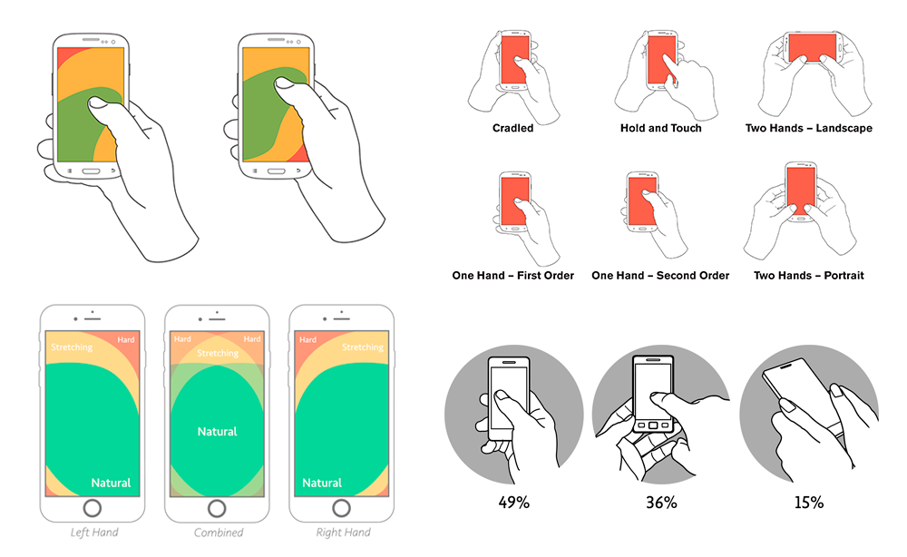
Mobile users depend largely on their thumbs to navigate through their devices. One of the most useful touch interaction zones would be the “thumb zone”. The thumb zone is an area of perfectly placed pixels that are within comfortable reach of a human thumb when holding a mobile device. Every designer must know which part of their website is within this zone. Also, keep in mind that thumb zones change with every device. Select your target demography, do your research, and find out which devices these people usually have and use. Then, maybe start brainstorming from there.
Mastering this knowledge will help designers select appropriate gestures and interactions for their apps and websites. Know your demographics, especially when almost half of all mobile users in the world rely on one hand, one thumb to use their devices. PRO TIP: when choosing gestures for interaction always stick to the thumb interaction zone. Avoid swipe gestures from hard-to-reach areas of the screen. Make sure that gestures feel comfortable and natural.

Image Source: Prototypr
The When: Know when a gesture = task
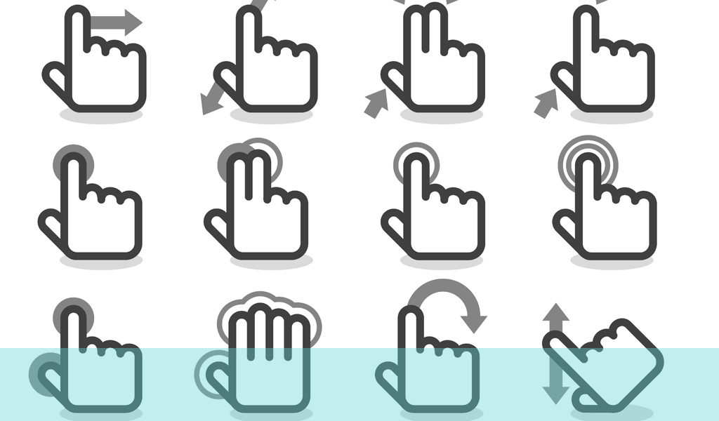
We actually see this often and we do this a lot on many apps and websites. Instead of wasting screen real-estate on buttons and calls-to-action, why not associate a gesture for a task? Good examples of this would be ‘Swiping Right’ on Tinder and ‘Double-tap to Heart’ on Instagram. Depending on the kinds of activities your users do on your website, you can also equate a gesture to a task. If you think that certain tasks are repetitive within your website and would add ease for your users, why not choose a gesture to replace it?

Image Source: UX 247
There are many ways to do this. For e-commerce sites, users could be prompted to ‘Swipe Up’ every time a product is to be purchased. This means swiping up equates to adding to the cart. For blogs, users can be prompted to swipe and pan on a slider to choose the content they want to view.
The What: Master all basic gestures at your disposal
Gestures that are too complex (two-step interactions, or multiple finger gestures) may not be within the knowledge of your users. Also, multi-finger gestures are more appropriate for devices with larger screens. On top of that, obstacles for more complex gestures exist (i.e. lack of mobility for hands and fingers). Furthermore, these complex gestures are hard to discover.
It is best to stick with the ‘core gestures‘ that are understood by all – across all users and all platforms. These gestures are familiar and are usually discovered by users even without prompt. On top of this, these gestures are also easier to code saving you time for other design tasks.
Also read: 4 Fun Alternatives to Loader Spinners
The post When and Where to Add Gestures and Interactions to Your Website


