Are you looking for some new design trends for your website but aren’t sure what the 2020 trends are?
It can be hard to stay up to date with technology and the trends that go with it since they change all the time.
We are here to tell you the top design and trends for 2020 that will help your website stand out and make visitors more interactive.
To see what design elements are hot in 2020, be sure to keep reading our post below and learn what you need to know.
Dark Mode is Popular
Dark mode is one of the hottest web design trends today. Wherever you look, you will find dark mode options such as web browsers and social media platforms.
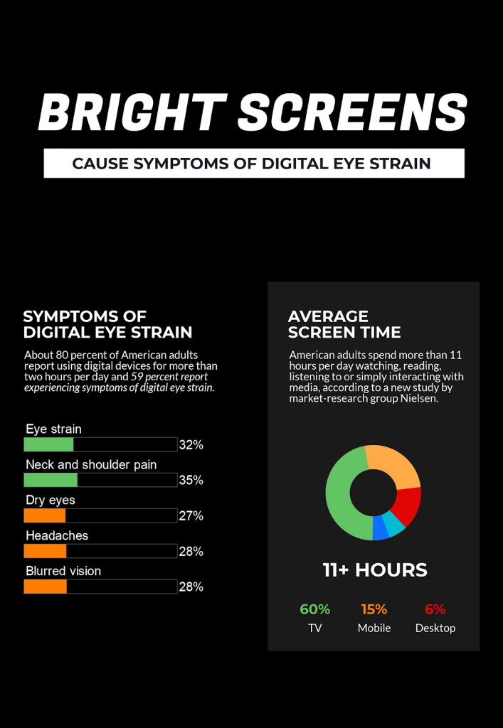
The dark UI is also known as a theme that displays a low level of light while maintaining a high standard of useability. Dark mode is an interactive web design that will help to reduce eye strain and will help to ensure that text is readable and eye-catching.

Add Some 3D Elements
Everyday web design has become more mature and things that entice the viewer such as videos, animations, and graphics are added to pages to help keep the user’s interest. Some of these 3D elements may even be animations that move on a loop to grab the eye of the person cruising the site.
Everyday web designers are becoming more creative and placing a variety of 3D elements onto their sites to interest users and potential customers. 3D visuals can be used to engage users without showing a lot of contexts.
When using 3D elements on your page to help advertise elements, you’ll come off as modern and energetic. These 3D designs can be used to have outstanding representation and help to bridge the gap between digital and reality.
Frames of White Space Help Your Site to Look Nice
Websites that appear to be neatly structured help to create a satisfying sense of order since it works to organize the many segments of a single page.
In the not too distant past, pages with full-bleed layouts were in high demand, but fast forward to today and it’s obvious that complete structures that play with ways of using white space and clean framing are in.
This clean and white layout helps to give the webpage a certain spark. So, in 2020 you should be prepared to give your website a revamp of frames and strategically positioned white space.
These white frames help to grab the attention of your users without making it too annoying and obvious. For a great execution of this design element, check out this page on the new Mac mini.

Use Illustrations that are Artistic to Catch Eyes
Pictures and illustrations can help to narrate your products or service in a way that’s easy to understand for any visitor and also helps to make the product a bit more exciting.
If you choose to implement artistic illustrations into your website, you’ll be invoking whimsical effects on your visitors and create pages that are appealing to the eye.
When it comes to visitors, illustrations will speak to them the same way they would when reading a picture book. It will help to narrate the purpose and help the visitor to slow down and take in the web page instead of scrolling straight through.
If you’d like to take adding illustrations to your site to the next level, then you should consider combining illustrations with actual pictures. This will help to convey realistic storytelling while making it stand out.
Minimalistic Navigation is Easy to Use and Looks Nice
Throughout the years, website navigation has become less complex and easier to use for the person viewing your site. In today’s web design world, there has been a shift to focus more on how users interact with your website to help determine your web design.
The secret to having a successful website is to engage the users. You will also want to make their experience as seamless as possible ontop of piquing their interest.
When you nail both of these things on the head you will be creating an experience that the customer remembers in a positive light, encouraging them to come back again and again.
To help send the minimalistic navigation home, try making the rest of your site minimalist.
Instead of using a lot of stock photos, try using less imagery and less text. Going minimalist in your web design will help to give your site a clean look and help to encourage those who visit your site to engage.
Use Some Typography for Design Elements
Using typography that appears to be floating in the free space on your site that can help to make your page eye-catching and even help to emphasize other elements such as images and videos.
To expertly use typography on your site, you should be used for design purposes and not for informative purposes. Typography can also help to enhance small details that are important and to make strong statements.

Now You Know of the Design and Trends in 2020
We have given you a list of the top design and trends for web design in 2020.
If you use 1 or all of these elements, you’re sure to have a website that appeals to your visitor’s eye, keeps them engaged, and will also keep them coming back.
From adding design elements such as eye-catching illustrations to using typography as a design element, you’re sure to have one of the trendiest websites in 2020. For more web design and element tips and information, be sure to check out the rest of our website.
The post What’s New for Website Design and Website Trends in 2020 appeared first on SpyreStudios.


