If you’ve been spending time on the internet since the late 1990s to early 2000s, you’ll notice how much the design of websites have changed over the years. We started from word-heavy web design and now, we’ve lessened the use of words and focused more on graphics and videos. Right now, Web Design 3,0, or Web 3.0 is the newest era of web design. But what is Web 3.0, exactly?
Evolution of Web Design
 Image Credit: Nice Page
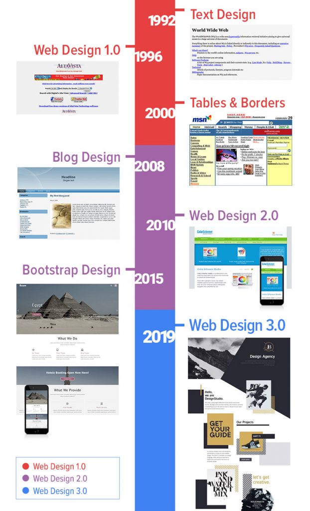
A post on Nice Page puts out a timeline of the development and changes of web design since 1992. As mentioned before, the websites we had were very text-heavy. To be accurate, websites then only had text. Eventually, we transitioned to Web 1.0; images were added to make the websites look easier on the eyes. Tables were also added, which eventually became grids that provided layout to websites. Web 1.0 was also the time when websites were not mobile-friendly because it wasn’t really needed that time. Moreover, mobile phones didn’t have the technology to connect to the internet then.
We then entered the Web 2.0 era. This is the era when layouts and grids got more flexible. Web designers now have more freedom – compared before – on how they want their web designs to look. Bootstrap contributed greatly then to web development as it made everything simpler and less complicated. At this time, websites have become much more mobile-friendly. Designing for different mediums like desktops, tablets, and mobile phones have become much easier for designers.
It was also during this time that creating blogs was very easy due to Content Management Systems (CMS) like WordPress and Joomla. Theme builders and website templates also emerged during this era.
With designers enjoying their freedom in design, they’ve had much more options in choosing pegs and inspiration. One of the designs that became a trend in web design is print design. This marked the start of Web 3.0.
Web 3.0
There are now a lot of elements added in web design in this era. Web designers are now utilizing background colors, even adding shapes and elements to the background. You’ll also notice that layouts are much cleaner now but at the same time, pulling off uneven grid layouts. Some websites also have big headlines, and others use abstract elements. Some websites are minimalist, while some are very focused on typography.
Basically, Web 3.0 is now focused on the aesthetic. A website can be minimalist and they can also contain various elements. Designers are free to do whatever they want as long as the design is clean and has consistent branding.
Application of Web 3.0 Design
If you’re looking for websites that are applying Web 3.0 design elements, you can look at websites such as Awwwards and Lapa Ninja. Here are some websites that we think really nailed Web 3.0.
Aebele Interiors

The Met Museum

Good Measure

These three websites are all great examples of using big headlines in their home page. You’ll also notice that Aebele Interiors and Good Measures also have texts overlapping images.
Koox

Speaking of use of shapes, graphics, and abstract elements in the background. Koox’s website is exactly like that.
Brews & Grooves

Meanwhile, the website of Brews & Grooves has an uneven grid layout that we were just talking about earlier.
Sophie Doukhopelnikoff

Senhoog

Lastly, a great example of minimal design or the minimalism aesthetic is these two websites, Sophie Doukhopelnikoff’s, a freelance graphic artist, website; and Senhoog.
The post What is Web 3.0? appeared first on SpyreStudios.


