Glassmorphism, shape design, retrofuturistic – these are just a few of the trendy design concepts of 2021. Design trends are getting cleverer and more intuitive in the recent years. Web designers have been developing hundreds of new ways to create impressive aesthetics. These design aesthetics are given more thought, creating works that are not only impressive but also attractive. Designing nowadays is more than just the looks. Instead, it is a step towards representing a brand and all the thought-processes involved in creating it. One of the more popular trends that we often see would be Glassmorphism. This design trend is surprisingly common that people have accepted it as quite of a norm, especially in UI.
Now you might ask, what is glassmorphism?
You see this kind of design trend more commonly than you think. In fact, brands like Apple have used this design concept countless of times in their products. Just open your iPhone and there it is – the iPhone user interface. This design concept involves an opaque background and a main element with a semi-transparent background. Then, the gem in this design is to add in a blur effect to seamlessly ‘morph’ the two different elements into one. It’s like imagining the semi-transparent glass in between the two elements.
The idea of the design trend is to create softer contrasts between light and dark elements. It is a method with which we could place a dark element on top of a colorful background and still be able to make them out from each other. It is an ingenious UI design technique to allow users to still be able to read texts and view interfaces, against whatever background their devices have.
The Blur Effect and Glass ‘filter’
The main feature of the glassmorphism design concept is the blur effect. Actually, it is more complex than just a blur effect. Now imagine putting an object behind frosted (or smoked) glass. You can see the object, its color, the silhouette, and its shadow. However, you can barely make out the shape and you feel like you are simply looking at color hues against frosted glass.
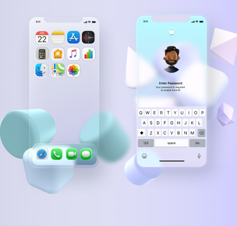
Image Source: Behance
This idea is made even more pronounced as common designs have solid images that suddenly get blurred when placed behind the ‘glass’ filter. Just like in this image, the marshmallow is solid and pronounced in the background. But when placed behind the ‘glass’ filter, it suddenly becomes blurry. That’s the kind of blur effect glassmorphism uses in its designs. It’s cool, it’s new, and it’s simplistic the way it is.
Stunning Examples of Glassmorphism in design
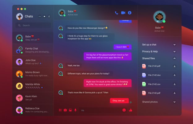
Image Source: Dribbble
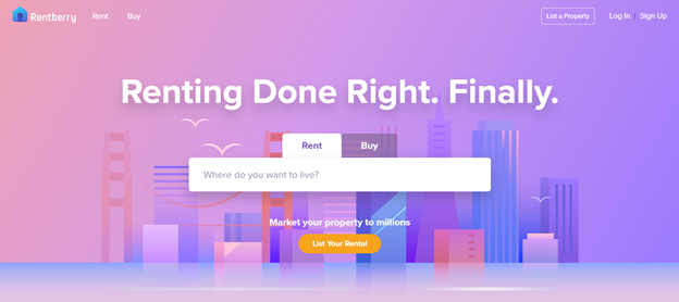
Image Source: Rentberry
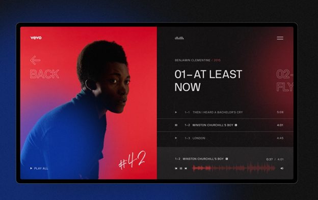
Image Source: Dribbble
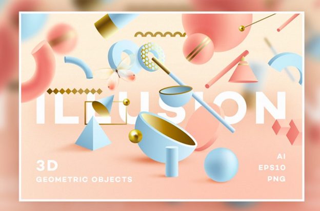
Image Source: Mockplus
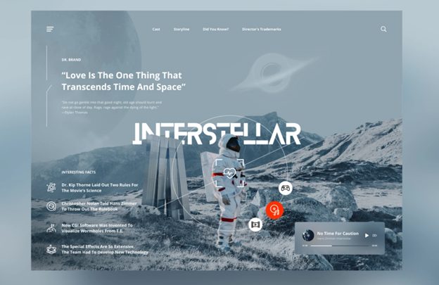
Image Source: Dribbble
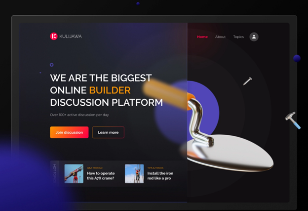
Image Source: Dribbble
The post What Is Glassmorphism? (With Examples)


