Trends always come and go in design. We must always be conscious of how people perceive a product and what changes we can make to improve. We have to anticipate the ever-changing preferences of society and adapt to it. An example of an upcoming trend we have to be aware of is emotional design. In fact, it’s said that being an “emotional engagement designer” may be the next big career opportunity. But what is emotional design?
What is Emotional Design?

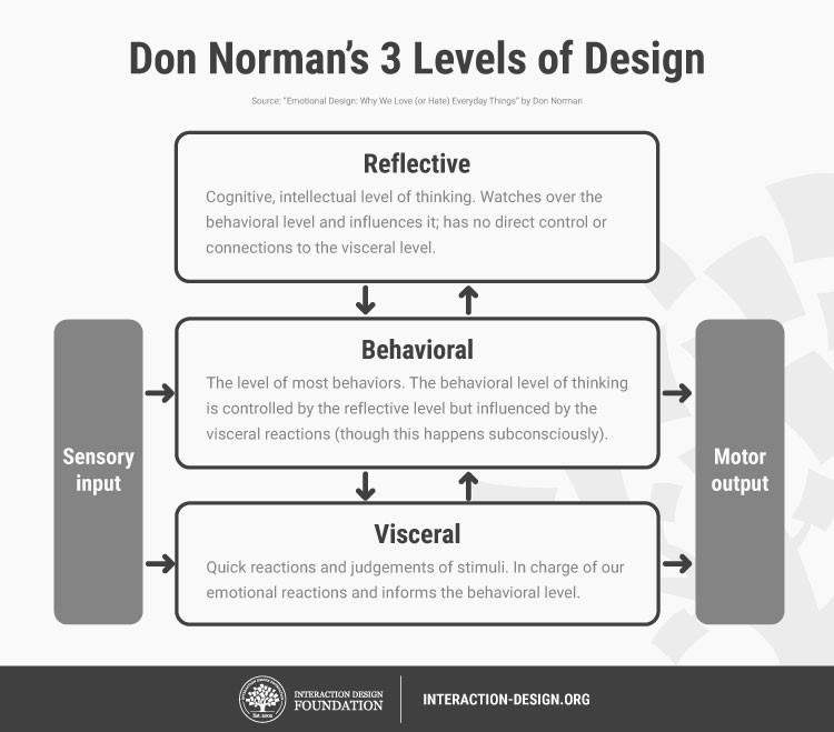
Emotional design is basically designing to invoke the emotions of the viewer, positive emotions to be exact. Don Norman created the term in 2003 and said that great emotional design has three levels: visceral, behavioral, and reflective. The visceral level focuses on the appearance and aesthetic of the product. Basically, it is someone’s first impression of the product. Behavioral looks at the function and usability of the product. This is when the person subconsciously considers how the object can help them achieve their goals, and how easy it is to use. While the reflective level looks at the product’s value and prestige. This is depending on the brand identity of the product, as well as when the person is already consciously thinking of the product’s benefits and performance.
Increasing User Engagement
So how is emotional design connected to user engagement? How can designing for emotion improve user engagement? In Don Norman’s book, The Design of Everyday Things, he says,
“Design is really an act of communication, which means having a deep understanding of the person with whom the designer is communicating.”

In UX design, we always consider how a user will interact and respond to your design. In this case, the response we want is emotion – which is where emotional design comes in. As mentioned before, emotional design is basically about invoking emotions from a person. This could be any kind of emotion but preferably, a positive one is the goal. By letting a person have a positive association with your brand or product, that person will be a potential loyal customer.
Norman’s 3 Levels of Design can be applied in various types of design – including digital design. You’ll notice that designs that are attractive, easy to understand, and has great branding tends to attract more customers. The visceral level, the first level, is very important as it is the person’s first impression. If you invoke a positive emotion from the person, then you already have your foot in the door. Let’s take for example Apple’s website.

The design is simple yet it looks attractive enough that people would want to buy their Apple Watch. While some may not be fans of Apple products, you can’t deny that the sleek look they’re going for is a great aesthetic. And it’s enough for people to instinctively think, “Oh, that looks good.”
The second level of design as mentioned above focuses on the design’s functionality and ease of use. Moreover, the design has to work well. When it fails to perform well, it’ll create a negative emotion towards the design. You can look at Apple’s products as an example of functionality. Most Apple users will tell you that one of the things they like about Apple is their system. The Macbook is connected to the iPhone which is connected to the Apple Watch.
In terms of digital design, behavioral is much more obvious to see in app designs. If something is easy to use, people would prefer that app over others with the same features. One great example of this is the Hopper app, a travel app that predicts flight and hotel prices.

The app is straightforward in its functions and the use of colors to indicate the best and worst deals really shows the app’s ease of use.
The last level of design, reflective, is all about self-satisfaction. When a user reflect back on their user experience and it felt good and they felt satisfied, then you’ve achieved the last level. To add, if they enjoyed your design, they’re not only bound to use it more, but they’re also going to recommend it to their peers. Most of the time, people tend to enjoy designs that are beautiful and they remember that experience. If two apps have the same purpose, but one is only functional while the other one also has great visual design, then the latter will be the better app for users. There is a reason as to why some apps, products, or even businesses perform better than others.
A design that invokes positive emotions engages users more, resulting in users coming back.
You might also enjoy:
How to Use Popups Without Damaging User Experience
Customer Care Chat Design Tips Which Will Increase User Engagement
The post What is Emotional Design and How Does It Increase User Engagement? appeared first on SpyreStudios.


