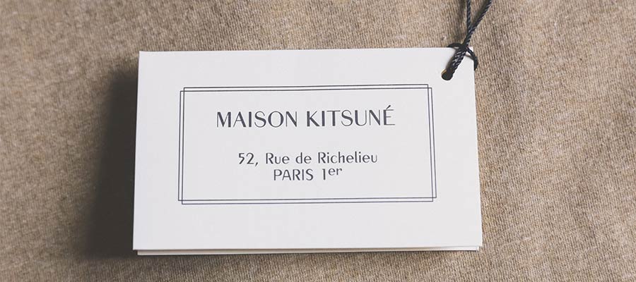
It’s challenging to build websites for clients. It takes communication and cooperation. Web designers also need enough resources to do the job right.
That last part can be tricky. And it’s not just financial resources that are in short supply. Clients may lack brand assets as well.
The issue often occurs with smaller organizations. They might not have the budget for custom photography or print materials. Thus, you could receive a low-resolution logo and not much else.
Is a logo enough to build a design around? You may be surprised at what a logo can inspire. Even basic images can tell us a lot about our client.
With that, let’s see what we can learn from a client’s logo.
Their Preferred Colors and Typography
Here’s hoping your client’s logo features a few colors. It’s a big help in determining the website’s color scheme.
However, even a single color will provide clues. You can create a palette based on a primary color. Several online tools will do the job for you. They’ll generate complimentary colors and shadings.
You’ll want to run these by your client for approval. But a logo can do wonders for inspiring the perfect color scheme.
The same goes for typography. Simple logo fonts could be appropriate for use elsewhere. For example, a clean serif font makes for a solid text heading. Unsure of the fonts used in the logo? You can use a font identification tool to help.
Script and display style fonts aren’t always a fit, though. They could be too difficult to read as headings or body text. But you can still use them as a basis for finding acceptable pairings.
The Client’s Personality and Tone
Is your client’s organization serious and buttoned down? Or maybe they’re a bit more relaxed? Their logo can provide clues.
Both color and typography tell a story. Bright and neon colors may indicate a casual vibe. An old-fashioned wordmark says it’s all business.
Illustrations also play a role. Does the logo contain a cartoonish figure? What about a simple line drawing of an office? Each can help you create the right mood.
You can also use this information when choosing other design assets. Items like icons and stock photos should match the tenor of the logo.
There are other indicators beyond the logo. Your client’s industry is important. Their communication style is also a factor. Still, their logo says a lot about who they are.

A Path for Reaching the Target Audience
Who is your client’s target audience? Their industry and clientele are deciding factors.
But details may be scarce. Clients with limited brand assets may not have a lot of demographics to share. And they’re unlikely to have a research budget.
In that case, a logo can show you a path to reaching the right audience. Or at least facilitate an educated guess.
For instance, an image could convey the relative age of the audience. And it’s also possible to target other identifying characteristics. Things like gender, identity, or financial status come to mind.
All of this assumes that the logo fits your client’s brand. That’s not always the case. However, web designers can only work with what’s available. Any imperfections are out of our control.

Making the Most of the Brand Assets You Have
Designing a website without brand assets is difficult. How can we create a relevant look without a guide? And even a client’s previous website may not be of much help.
In many instances, a logo is all we have to go on. It happens time and again, even in this digital age. And it presents a challenge for web designers.
However, a decent logo provides a starting point. It can lead us to some answers. We can use it to craft color and typographic schemes. And it’s also possible to understand more about your client’s personality and target audience.
At the very least, a logo serves as a basis for discussion. Assess what you have and ask for your client’s feedback. You may be on the right track. Or your client may have to go back to the drawing board.
Either way, the logo might be the best tool to move the project forward. There are more details within than you may think.
Web Design When a Logo Is Your Only Brand Asset Medianic.


