Сustomers consume an insane amount of information every single hour, and it’s getting harder to retain their interest long enough to gain profit. Thus, the content of your online store needs to be qualitative, gripping, and, of course, visual. The thing is that it’s much simpler for a human to process visual data than text. And it’s hard to disagree that it makes much more sense to see an item once than to read a long description about it, especially when you’re shopping online from a mobile device.
As a designer or a developer, you have to know which site elements require extra attention. It’s all about great UXUI, intuitive navigation, and creative design. As a result, such upgrades can lead to better conversions and customer satisfaction.
You see how store owners follow customer desires and ask you to tweak their eCommerce sites to increase revenue. Thus, in this article, we’ll give professional UXUI design recommendations to follow besides traditional practices like Magento image optimization and fixing performance issues. We’ll introduce you to 5 outstanding visualization “moves” and advanced elements that renowned eCommerce stores are already using to their benefit. So, you can sit back and take the best visualization strategies into account.
1. Product Builders for Customization
Product constructors are indisputably a great attraction for users. It’s so fascinating to put a hand into the designing process, isn’t it? Choosing the unique color and material matches, shapes, and additional features, people can create one and only pieces to their liking. Customizers are also a superb option for making unrepeatable gifts.
Product configurators are applicable to clothing, footwear, accessories, furniture, and even cars. For example, take a look at the screenshot below from an American jewelry store Kendra Scott that offers you to modify earrings, necklaces, bracelets, and rings. You can opt for the features that fit your taste the most: the item’s shape, metal, and stone.
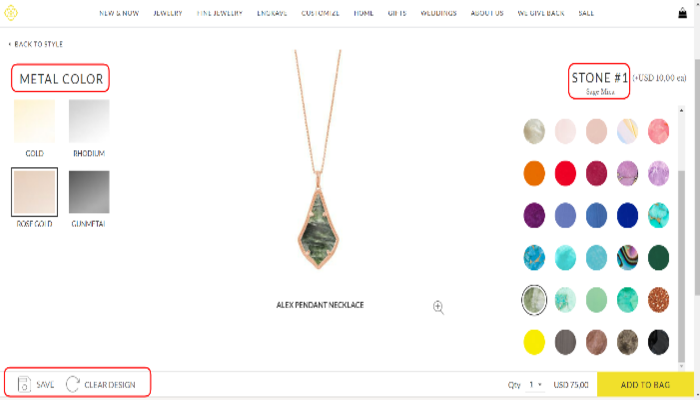
Source: Kendra Scott website
2. Trying on Products Virtually
Harvard Business Review cites the striking stats: 51% of consumers would like to use AR and VR as assistance in choosing products. As a result, many retailers (especially after the beginning of the Covid-19 pandemic) have listened to the customers’ wishes and implemented so-called virtual try-on into numerous online and offline stores.
You can try on a hair dye color, nail polish, foundation, lipstick, mascara using your phone/web camera or by uploading a photo (see the screenshot below from L’Oréal Paris). Most virtual try-on services offer to see the before and after looks by mousing over a window. Then you can save the photo or shop the products straight away.
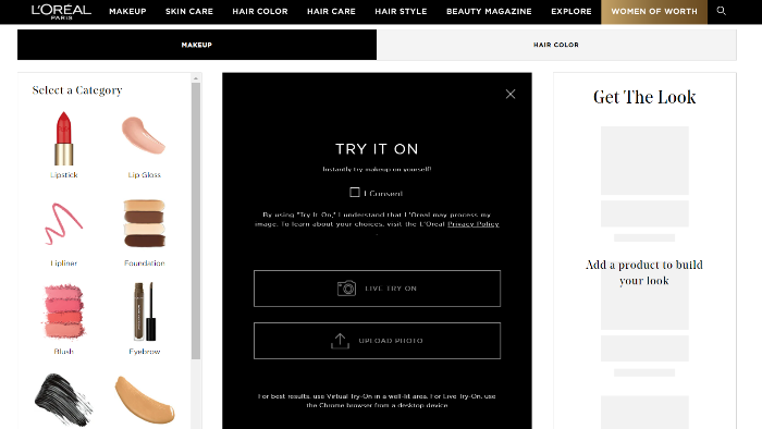
Source: L’Oreal Paris website
3. Using Animation & Graphic Design
Motion is eye-catching by default. Thus, brands actively leverage animation, graphics, gifs, and videos in order to engage users. These elements can be located on the main page, catalog, and product pages, depending on the current aims. They can draw attention to the new collection, collaboration, or a particular project.
It’s especially reasonable to place motion elements on the main page to involve visitors from the very start. In the screenshots below from VANS, you can see the GIF that draws one’s attention to the fresh collection of shoes. Vans likes to use this trick on their website. Gifs appear at least several times while you look through the main page.
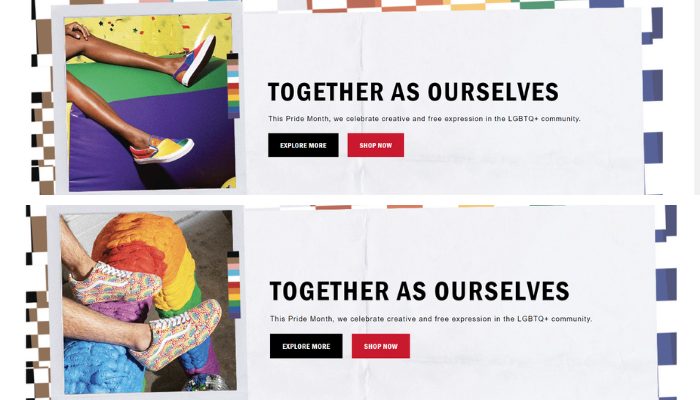
Source: VANS website
4. Cross-Selling Products Using “Looks”
You can aid your clients and raise sales if you add one important block to every product page. This is the styling section to visualize one’s future outfits and add more products to the cart. With different combinations of an item showcased, prospects will better understand what matches their choice.
Such wholesome product recommendations hugely enhance the cross-selling and up-selling strategies of an online store. Below is the example from Puma. Their “Hot to wear it” section is brilliant as it shows several possible outfits at once. Moreover, after clicking the “Shop now” button, you can change the selected pieces to similar ones of other colors/prints/styles. This is the full-fledged outfit constructor that can carry away visitors for hours!
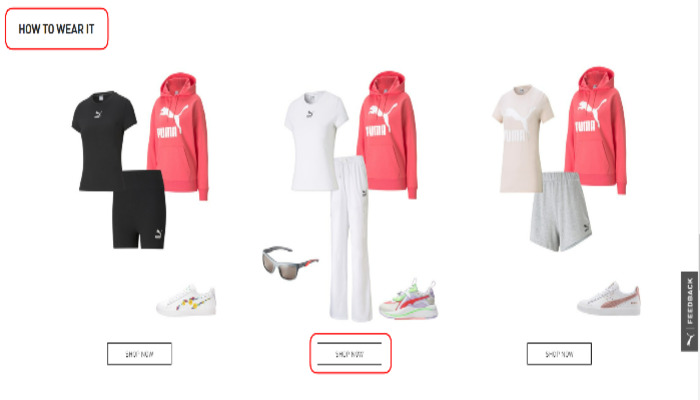
Source: Puma website
5. Highlighting Unique Product Details
At a glance, any sort of description seems to be the most boring part of a product page. Basically, this is a chunk of text. But there are eCommerce brands that transform simple listings of benefits into appealing visual elements.
Take a look at how Maybelline managed the task to underline three main advantages of their new lipstick. They applied unusual layout, tempting photos, and concise texts. This is a beautiful example of how unique visualization can emphasize various peculiarities of an item.
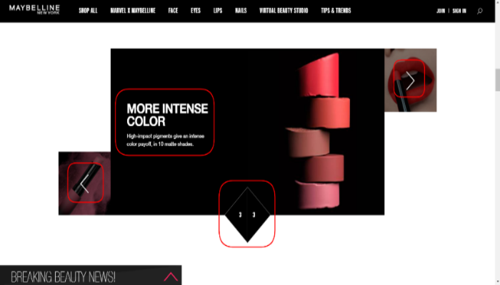
Source: Maybelline New York website
To Conclude
The design and overall UX/UI of your online shop have a strong influence on people. Visual elements grab one’s attention, set the right mood, work on your company’s image, and even convince prospects to buy. Investing much in core measures like page speed optimization or customer service enhancement, do not overlook the design side of your eCommerce business.
About the Author
Alex Husar, Chief Technology Officer at Onilab. For over eight years, he’s been working on Magento migration and development projects as well as building progressive web apps (PWAs). Alex is an expert in full-stack development who shares his expertise and in-depth knowledge on modern technologies and Computer Software Engineering.
The post Top Visualization Elements on eCommerce Sites to Skyrocket Sales


