Anyone could learn how to create websites through continuous training and practice. However, this could get eventually boring and de-motivating. The great news is that game devs have created games that help newbie web designers hone their skills for both web design and coding development. Here are a few examples of coding games and web design games to test your skills:
Coding and Programming Games
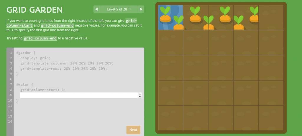
Grid Garden
This interesting game measures the user’s ability to use the CSS language. The goal is to grow carrots by taking care of it. The player has to water the carrots and poison the weeds. However, the player could only use code to get access to water and poison for watering the carrots and deweeding. It is a great game for kids learning to code or for beginners who want to try somethign new.

Image Source: Grid Garden
Flukeout
It could be compared to translating an HTML code to its CSS counterpart. The concept of the game is a restaurant where the user could only use CSS code to carry out tasks. For beginners and children, this could be quite a confusing game. But a rather easy one for masters.

Image Source: Flukeout
Flexbox Defense
Just like any defense game, the player should move around elements to protect their base. Here, the goal is to move towers to blog waves of incoming enemies. However, compared to other defense games where the player can click and drag elements, the game could only use code. This game is really great for beginner learners and an exciting one to beat.

Image Source: Flexbox Defense
Web Design and Management Games
Can’t Unsee
The game Can’t Unsee is more of a web design game than a coding game. It is about comparing two images of web layouts (or mobile layouts) where the player should choose which one is more correct. Although the differences are minor, one can see that it creates a huge impact on user experience. The game, kind of, trains the players to select the right text colors and sizes. It also trains them to use the right contrast (or opacity) against a backdrop. The game shows how alignment, icon sizes, and even text type plays a huge part in the overall look of a website.

It is a really simple game and it could eventually get boring. It gives no excitement as it does not have any time limit and the points really go nowhere. However, it is a good game for beginner designers as it indirectly gives tips on how to properly design the minor details of a website. In the second photo below, it is not that obvious but the word ‘search’ on the left starts with a small letter while on the right, it starts with a capital letter.

Image Source: Can’t Unsee
Type Connection
The overall gameplay of Type Connection is unusual and unexpected, but in a very interesting way. The concept of the game is that it is a dating game for typefaces. It is the goal of the player to create a good match between two different typefaces by learning about the characteristic of the typeface. The player is the matchmaker, through several strategies the player shall combine together two typefaces and the game will assess its compatibility.

Image Source: Type Connection
It is a confusing game to play at first, but eventually players could get the hang of the concept. Through this game, the player can learn about different typographic terminologies. It will give some context about the history of the text. For instance, it will tell something about the type of tool is used to create it like pen nibs, brushes, or sprays. The game will also tell something ab0ut the inspiration behind the creation of the typeface to easily match similar ones together.
Pixactly
This is a really difficult game but playing it again and again does train the mind to think in pixels. The concept of the game is that it will give an image size. The player should be able to create a box (by dragging) that would match the given image size to the tee. The game will give a low score for exact matches and a huge score for mismatches. The goal is get the smallest possible score. This will be an easy game for masters that have been used to designing websites as a career. However, it could be good training for beginner designers.

Image Source: Pixactly
Shape Type
The goal of the game is to adjust the shape of the typeface to match the original. There are differnet dragpoints shown but the game only allows the user to adjust in specified points. Then, the game will score depending on the percentage of similarity between your adjusted type to the original. Basically, the game teaches about proportions. It allows a user to use intuition to create a proportional image. The user could adjust the image based on unspecified standards or simply eye-ball the whole thing. It is a really interesting game and gets the mind to think like a pro.

Image Source: Shape Type
Also Read: 16 Colorful and Vibrant Websites for Inspiration
The post These Fun Games With Surely Test your Web Design Skills appeared first on SpyreStudios.


