The season’s web design theme would not be complete without spooky Halloween typography. Typography is a trendy way to use text and fonts to convey creativity. Some designers use witty lines to create a dramatic effect, while others simply use fonts to create an aesthetic. In doing Halloween-themed designs, designers could do both.
Primarily, the point of using spooky Halloween typography is to grab the readers’ attention. Imagine, a designer could easily convey a spooky message without all the blood and gore, but simply by using Halloween-themed fonts. These are clean, legible, and easy to the eyes while still celebrating the sinister vibe of the holiday.
There are a lot of typical font face designs like spiderwebs, melted letters, pumpkins, skulls, ghosts, and more. But, in recent years new “scary” trends have surfaced which gives Halloween typography some cool, new vibe.
Here are some very cool, yet spooky, examples of Halloween font faces and typography:
Cool and Fun Halloween Typefaces on the Internet
These are some new takes to your “typical” Halloween fonts. Lots of times we see all elements in one single design – a greeting card complete with blood drips, spider webs, and skulls. Nowadays, Halloween font designs are more focused on highlighting just one “spooky” element.
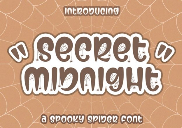
Secret Midnight
This is great for kid-friendly websites that want to add in a little ounce of spook, but not too much. The presence of small spiders (seemingly spindling the webs) in every letter may look like such a small detail, but it just completes the design, doesn’t it?
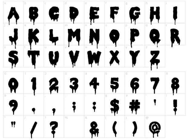
Double Feature
A more modern take to a melted dripping design, the double feature font design has rounded characters instead of the typical pointed ones. This creates a visual that whatever melted liquid the designer envisions for his design will naturally drip down from around the shape of the letters.
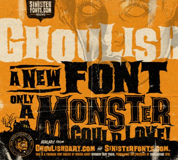
Ghoulish
This font design just speaks monster, in all sense of the word. It gives off a creepy and ragged visual similar to how anyone will feel when seeing a ghoulish monster.
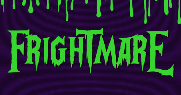
Frightmare
A similar take to melted letters and slimy drips, Frightmare adds a little more edge by making the ends of the letters pointed like a blade.
Samples of Unique Halloween Typography
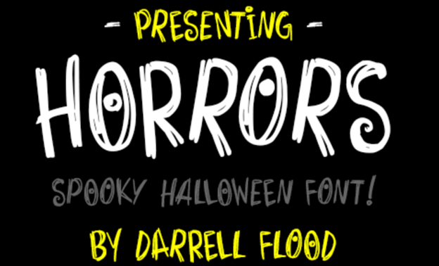
Horrors
Horrors are unique Halloween-themed typography as it does not look as scary as it is intended. But, if you realize that the dots are eyes, it may still give you the creeps.
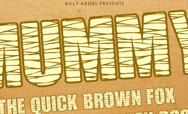
Mummy Font
This mummy-designed font-face is also a great font for kid-friendly websites.
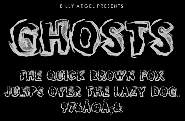
Ghosts
Usually, ghost-themed font designs are drawing with cartoony bedsheet ghosts. This particular font design gives a more eerie feel to the ghost element by simply focusing on hues and shadows.
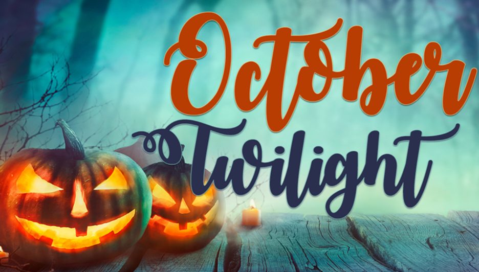
October Twilight
Compared to the “typical” Halloween design, October twilight creates a more romantic vibe to the design. There is just something about horror and romance that complements each other.
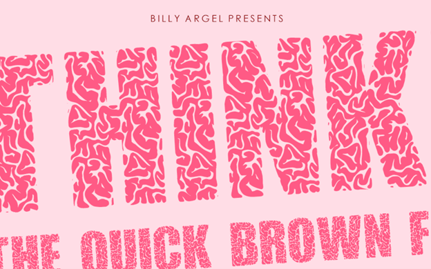
Think Extra
How witty is it to name a brain-themed font design as “think extra”?
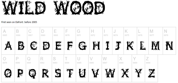
WildWood
Everyone who loves attention to detail will surely like Wild Wood.
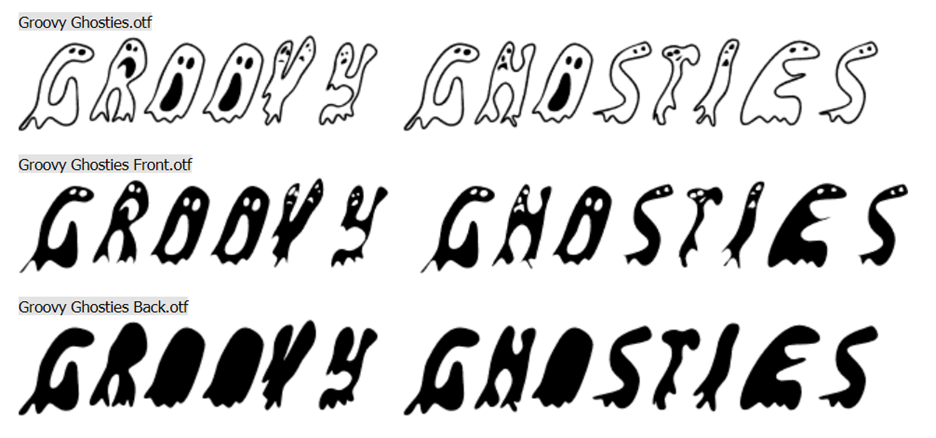
Groovy ghosties
If you are going for a bit of a retro design (like a Ghostbusters vibe), the Groovy Ghosties font is a great option.
Typography for body text
These are the type of font faces that are great to use for body text. These are simplistic in design but are still sinister enough for Halloween.
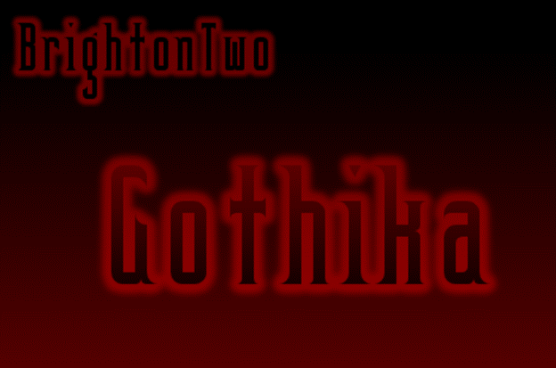
BrightonTwo Gothika
Ravenscroft
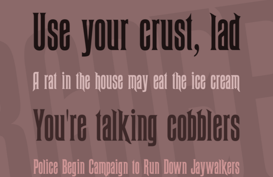
Warlock
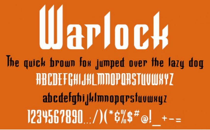
Spooky Halloween

Examples of Halloween Typography on Websites
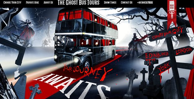
Here are some examples of how web designers used Halloween typography in their works:
Halloween Costume Contest Poster
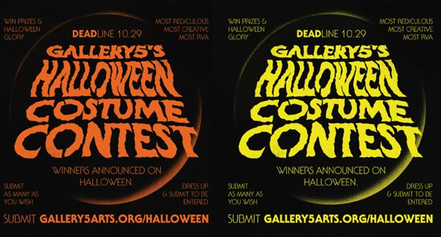
Halloween Greeting Poster
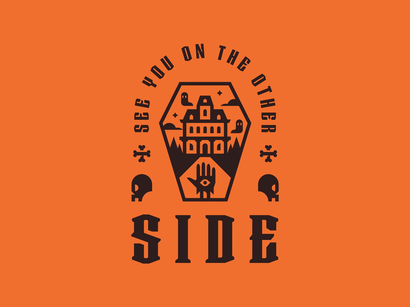
Ghost bus Tours Website
Boo Party Website
Also read: Halloween Design Elements for Kid-Friendly Websites
The post Spooky Halloween Typography for 2021


