Tackling the challenge of creating an accessible website–or making an existing website accessible–can sometimes be a difficult task. It can be awkward to understand exactly how a user with low-vision, for example, might use a website. Naturally, it can be difficult for us to be happily satisfied that our sites are accessible.
In this post I’ll show you that testing accessibility doesn’t have to be a difficult task. I’ll walk you through the tools and processes we use at Envato to keep our platforms usable to those with all levels of ability and to ensure accessibility stays at the front of our mind when delivering new features.
Google Lighthouse
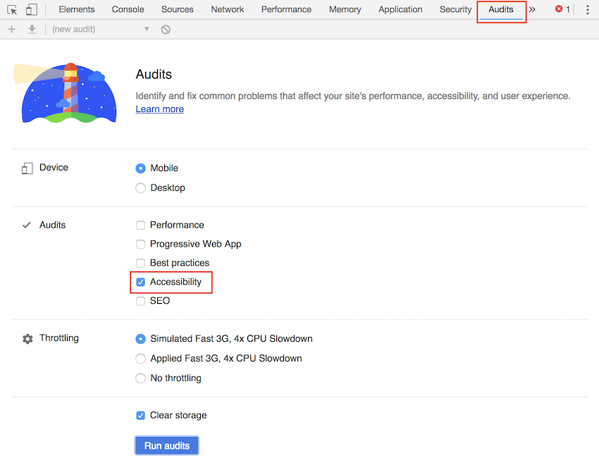
One of the most important tools we use when judging our accessibility is Google Lighthouse. Lighthouse is a tool to assess the extent to which a website meets industry best practices–whether that be for performance, SEO, or in our case, accessibility.
Lighthouse can be run either via the online interface or via the Chrome developer tools. A significant advantage of using Lighthouse is that it allows us to know exactly what Google relies upon when deciding how accessible they believe our site to be.
To access Lighthouse via the Chrome developer tools:
- Open Chrome.
- Press CMD + Shift + C to open the developer tools.
- Click on the Audits tab.
- Ensure Accessibility is selected.
- Hit Run audits.

Once run, we get a break down of where our site could be improved to become more accessible. For example, results from the ThemeForest search page look like this:

Lighthouse gives us a list of areas where our page is not deemed accessible, as well as a list of manual checks we can perform to ensure accessibility is the best it can be. If a particular check isn’t making sense, Lighthouse provides inline links to read more about what should be done.
From the above report I can see that we should be looking to improve our color contrast to better cater to those with impaired vision. I can also see that I should be able to tab through the page in a manner that makes sense in context, as well as various other checks.
Pa11y
Another fantastic tool we use at Envato is pa11y (named after the abbreviation commonly given for accessibility, “a11y”. Pa11y allows us to set a predefined accessibility specification level–Section 508, WCAG 2.0 A, AA or AAA–and test a webpage against those specifications.
When run, pa11y provides us with a list of the accessibility specifications we meet and those we don’t yet meet, as well as a recommendation on how to achieve compliance to each standard. The advantage of using pa11y is that it allows us to be absolutely sure of compliance with WCAG specifications as well as giving us concrete steps to become more compliant.

At Envato we run pa11y automatically before each new piece of code is deployed to our platforms using pa11y-ci. However, pa11y can also be run using the desktop application Koa11y.

Firefox Developer Tools
One area in which Firefox developer tools excels is in inspecting how accessible our site content is. This allows us to take the guess work out of understanding how a screen-reader reads our content to a user.
To enable the accessibility inspector in Firefox:
- Open Firefox.
- Press CMD + Shift + C to open the developer tools.
- Click on the three three dots on the top right corner of the developer console.
- Select the box labelled Accessibility.

Once enabled, an accessibility tab becomes available to us. This allows us to see our site as a screen reader might read it aloud.

The aria-role is listed on the left, in this case either section, link or graphic. Not every element should have a name, but the attribute is a good way to indicate something to a user–we can include a name by making sure textual content, an image alt tag, or an aria-label attribute is present. We can also hover over the role and have Firefox highlight the corresponding element in the markup.
Browsing this tree is useful by itself just to get an understanding of what our website looks like without anything distracting us from the content. It’s also an excellent way to get an understanding of how a new feature might appear to our users.
Code Linting
Another useful level of checks we use when writing out code is done via code linting. Linting allows us to be automatically alerted to pieces of code which are guaranteed to be inaccessible. We use a subset of Microsoft’s TypeScript linting rules to lint our TypeScript. We also use the eslint-plugin-jsx-a11y package to lint our JavaScript.
A linter might warn me, for example, that I’d forgotten to include an alt tag on the following image:
Another example might be a warning for the inclusion of an element that could be distracting to those using screen readers:
Linting provides instant feedback to allow us to make quick changes as we go to ensure the final product is as accessible as possible.
 JavaScriptModern JavaScript Linting With ESLint
Browser Extensions
We use a number of browser extensions to get a better feel for how a user might experience our site as we create it, so we can make adjustments as we go. These are a couple of stand-out extensions which we’ve flagged as being especially helpful.
Spectrum
Spectrum allows you see your site the same way as those with various forms of color blindness would see it. With this we can see parts of our site which may have poor contrast against the background, or links whose active states are too similar to their passive states.

Dark Background and Light Text
Dark Background and Light Text allows you to view your site in high-contrast mode–a mode often used by those requiring high levels of accessibility. With this we can see if parts of our site are either too cluttered or too small to be seen effectively in this mode.

Mac OSX VoiceOver
This one’s only available to those with a Mac, but it goes along way in experiencing a site as a user with low-vision would. VoiceOver reads selected text to us on command. It does take some getting used to, but once learned it’s easy to use. On the web, VoiceOver has best support for Safari, but it can be used with the entire Mac OSX operating system.
Enable VoiceOver with CMD + F5. Once enabled, some convenient functions you can turn on can be found via:
- System Preferences > Accessibility > Speech > Speak selected text when the key is pressed
- System Preferences > Accessibility > Zoom > Speak text under cursor
Conclusion
Ensuring your website is accessible is absolutely worthwhile. It’s often viewed as a task which is either too difficult, or that has been left too late to achieve. Neither of these are true, and certainly aren’t what we’ve found at Envato. Using techniques and tools like the ones I’ve described above takes much of the hassle and guess work out of building an accessible website, giving us confidence that the end product will be friendly to all our users.
Learn More About Accessibility
 Web AccessibilityA Beginner’s Guide to Web Accessibility
 AccessibilityAccessibility Basics: Designing for Visual Impairment
 AccessibilityAccessibility Tips for WordPress Theme Developers
 AccessibilityA Beginner’s Guide to Email Accessibility (Checklist + Resources)
Powered by WPeMatico


