We know that there is a lot of work involved when it comes to designs. Every element designed has a reasoning behind it – from the colors to the shapes and even the look of the texts. Looking for the right font to use for your texts can be a time-consuming task. Fonts, in the grand scheme of things, seems like such a small part of a design. However, how it looks and how it complements your design will create a huge impact on the message you want to convey. In this article, we will be looking at how to find a font that suits your purpose or objective the best.
Font Psychology
For some, font psychology may be an unfamiliar term but it does exist. People associate different things with different kinds of fonts – which is where font psychology comes in. Official documents such as business letters, resumés, and school applications require professional-looking fonts, while posters, logos, or any creative outputs often use creative fonts, like cursive or handwritten – depending on what kind of image they want to portray. By understanding how a font’s look works and resonates with the audience, designers are now able to choose the right fonts for their designs and even more, avoid using wrong fonts that can be misinterpreted by the audience.
Choosing the Right Type of Font
Fonts are categorized by different categories and there are 5 major ones: Serif, Slab Serif, Sans Serif, Script, and Modern.
Serif

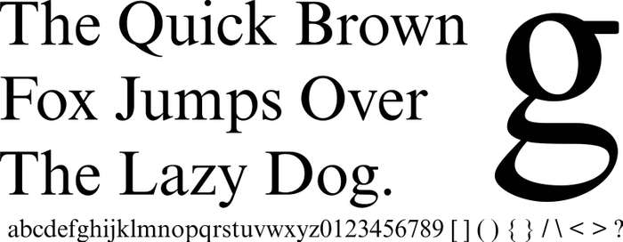
Serif fonts are known as the classic fonts. Most companies that are established and traditional use these types of fonts. If you want to exude an image of tradition, practical, and formal, serif fonts are the way to go. These types of fonts are usually used body texts, printed materials, presentations, and company logos that project authority and formality. If you want to find a font like this, examples of this type are Times New Roman, Garamond, Georgia, and Baskerville.
Some organizations that use this font in their logos is Yale, Time, and Wells Fargo.
Slab Serif

If you want to find for a font that shouts boldness and innovation, Slab Serif fonts are the ones to use. They’re similar to Serif fonts, but instead of being formal and traditional, they’re much friendlier, trendy, and confident. These types of fonts are usually used for logos, titles, or headlines. For logos, they’re commonly used by car brands, and tech companies as these groups want to create an impactful and innovative image. Fonts that fall under this category are Clarendon, Museo, Courier, and Rockwell.
Volvo, Honda, and Sony are some of the organizations that use the fonts under Slab Serif.
Sans Serif

Sans Serif is the last category of the Serifs. If they were a family, Sans Serif is the fun-loving cousin. Fonts under the Sans Serif category are the clean, modern, and straightforward ones. No frills needed. Just like Serif, these fonts are used in body texts, titles, and logos as well. If you see an organization using a Sans Serif font, clarity, modern, and universal are the things they want to be known for. This is why fashion brands, tech companies, and start-ups usually use these fonts. Examples of Sans Serif fonts are Helvetica, Century Gothic, Arial, and Verdana.
Some companies that use Sans Serif fonts are Nike, Microsoft, and Evian.
Script

Unlike the first three, Script fonts have much more going on. The fonts under this category are much more elaborate, detailed, and they somewhat mimic a real person’s handwriting. Depending on the font used, Script fonts generally project the image of creativity, sophistication, elegance, and femininity. Moreover, some fonts are able to add a personal touch on texts since they look handwritten. Examples are Lucida Script, Edwardian Script, and Lavanderia. Other than logos and titles, Script fonts are usually seen in invitations as well. If you are aiming to project creativity, invoke feelings and experiences, Script fonts are the best fonts to use.
Cadillac, Instagram, and Coca-Cola are just some of the organizations using the Script font for their logos.
Modern

Modern fonts, despite its name, has been around since the 18th century. These types of fonts can be thin, thick – as long as they are modern-looking and legible. Moreover, unlike Script, they are also very easy to read. If your brand or business’s target audience are millenials, using Modern fonts are effective in attracting them. This is because aside from telling people that your business is “modern”, these fonts can also create an image of intelligence, progressive, stylish, and even exclusivity. If you want to use Modern fonts, you can try looking into using Politica, Matchbook, and Futura.
The most prominent company that uses this font is Facebook. Other companies that use Modern fonts are Hulu and Nars.
Display

While not a part of the major categories, there are also fonts that are just meant for decoration. These types of fonts are unique and creative and more often than not, customized to a brand’s identity. These fonts are mostly used for logos because they have a very different style, and they add personality as well. Examples of Display fonts are Gigi, Jokerman, and Valencia.
Disney, Fanta, and Lego are just some of the companies that use Display fonts for their logo.
You might also enjoy:
How To Select the Best Font For Any Project or Website
33 Free Display Fonts for Attention-Getting Headlines
The post How to Find a Font appeared first on SpyreStudios.

