Establishing a brand, a blog, or a website is never easy at the beginning. The competition is high and most internet users prefer reading from established or well-known brands or websites. Giveaways are a good way to increase the popularity of a brand (for e-commerce) or a blog. It is an effective means of gaining organic internet traffic. On the other hand, getting people to participate in the giveaway is necessary for the website to reap its benefits.
Usually, giveaways landing pages are used to direct a user towards the target website. These landing pages could be shared on various social media platforms. Once these are shared, other users or visitors can be re-navigated or directed to the blog or e-commerce website.
Here are some Giveaway landing page examples and their gimmicks to boost participation:
Use of Very Compelling Copy
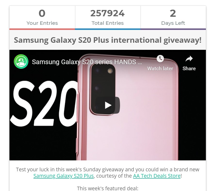
The point of a giveaway is to make internet users excited about a new blog or a product. Catchy phrases encourage the readers to scroll further, lousy taglines just don’t cut it. It is also important to keep the instructions clear. Instilling a sense of urgency by highlighting the end date (and existing number of entries) also motivates users to complete the tasks immediately. Most importantly, keep the users aware of what prize (or prizes) they may win if they join.

Image Source: Android Authority
Allowing Daily Entries
So that users can repeatedly interact with a webpage, website, or social media page, allowing daily entries may be a good thing. One example would be i-Blason’s giveaway challenge where one task is to search the phrase “Note 20 Case by i-Blason” on Amazon to gain a daily entry to their contest. This allows more their products to get more SEO hits on Amazon, and probably gain a spot as a top search item. Not only is the product getting more searches and hits on Amazon, but the user also gets additional chances to win every day.

Image Source: i-Blaison
Logins from Different Platforms
It is important to remember that although social media is pretty popular right now, not everyone has Facebook, Instagram, Twitter, or even a Gmail. A good majority of giveaways online only use Gmail, Twitter, Instagram, and Facebook. A few others allow entry via a different email. Some others also allow a few more social media platforms like YouTube or Amazon. Maybe the addition of Reddit, YouTube, Steam, or Twitch is good to consider.

Image Source: Oukitel
Just like in the giveaway landing page of Oukitel, they added a total of 19 platforms that users can use to log-in. This is good to increase the market range and really tap various users all over the internet. Adding social media options is good, but this may be adding too much. On the design side, adding too many social media links to the landing page surely does not look appealing.
Avoid adding too many ways to enter
It is always a good move to allow users to choose from a variety of tasks to increase their chances of winning. Easy tasks including liking a page, sharing a website, or referring a friend for subscription are common multiple tasks giveaways use to create more interaction between the webpage and the user. However, if each task is given only one entry, not many users will get the motivation to do all the other tasks. Instead, they may think that joining the giveaway is too much work and avoid the interaction entirely.
Do a single easy task to enter
One good way to surely get a user to interact with a landing page is to reduce the work to a single task. However, this task should be beneficial for the blog or webpage in terms of hits and organic internet traffic. One way to increase traffic to a webpage or blog is to make it shareable on social media. It could be gaining entries by logging in on social media or simply hitting the like button.

Image Source: Gleam
The giveaway task could be to share a hashtag (or the page itself) on social media and getting the most likes for the share. Maybe it could be as simple as liking (or following) the social media page. For blogs, it could be signing a subscription. Getting users to participate in giveaways through one simple task is easy. For instance, Red Magic’s giveaway promo requires users to refer a friend for a total of 30 entries.

Image Source: Lo-Fi
Offer Consolation Prizes
When tens of thousands of entries are vying for just one major prize, some users might get de-motivated to join a giveaway contest. Offering a variety of prizes, or consolation prizes, will give some form of motivation to join. At the very least, if they don’t get the chance to win the main prize, someone else will get to win a much smaller prize.

Image Source: Gleam
Always announce the winners
For some contests where the prizes are too good to be true and winners are not announced, people may think it was merely a scam. This would discourage users to join future giveaways and contests. Announcing winners will get users to believe the credibility of a brand or a website. This example from Android Authority uses Facebook to announce its winners. Winners have photos of what contestants won and the website also announces which contests they won.

Image Source: Android Authority
Also Read: How to Make Your Own SVG Files
The post Giveaway Landing Page Examples to Boost Participation appeared first on SpyreStudios.


