Designing effective navigation menus should be a core competency of any decent web designer. A good navigation menu will be short, well-organized, sufficiently descriptive and effective at corralling user intent. There no secret recipe involved: it comes down to empathy for the user and understanding of their intentions.
Address The User’s Need
Before you build a single pixel of your navigation menu, you should map it out in wireframe. This should include the names of every element and subelement, what needs to be clicked to reveal what elements and so on.

Squarespace uses common user needs as navigation menu options in this sample site.
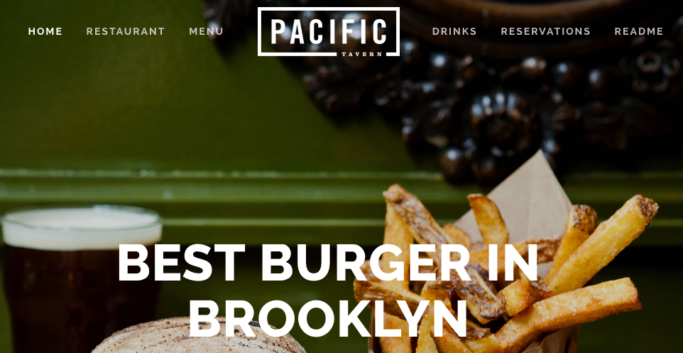
Navigation should always start with what the user needs. The top-level menus should use the kind language that users would employ to describe their purpose. Refer to user surveys or industry standards to determine what these should be. If you’re unsure, you can follow this basic structure and order:
- Core website purpose (shop, portfolio, tools)
- Secondary purpose (our locations, story, etc)
- Contact/About
- Help
- Search
In a broad sense, a good navigation menu should go from most specific on the left to most general on the right. Start with the most common user need or action and gradually transition into broader ideas like Help, FAQ or Search.
Speak the User’s Language
Naming should also adhere to user expectations. Now that the web is no longer new, users have normalized certain navigational items. We know that the “Contact” menu includes phone numbers, addresses and potentially a contact form. “Help” or “Support” will bring us to a place where we can get support for products or software the company creates.

Artisan uses clear, action-oriented language to make sure the user knows what to expect.
Lean heavily on these standards to make your users’ lives easier. Don’t try to reinvent the wheel or assume you can do better. Unless cute rule-breaking is a critical element of your brand’s unique selling point, the user will be annoyed with you personally and your brand.

Varagon’s language isn’t precise enough to be helpful.
Also, avoid generic or vague language if possible. Terms like “experience” or “our passion” probably won’t help the user understand what they’ll find on that page, even if you feel like it makes perfect sense.
Use Drop Downs With Care
Drop down menus can be tempting. They’re an easy way to expand your navigational menu without messing up your design. But from a user’s perspective, they’re treacherous. Implementation varies widely from site to site, with no clear standard for the “best” drop-down menu. As a result, users are perplexed about the “correct” action to take when trying to navigate your site, resulting in an unpleasant user experience. They also add very little utility: all you’re doing to passing on an editing decision that you should have made to the user. Instead, they have to decide what’s important. That’s not the user’s job: that’s your job.
Further, drop down menus are a usability nightmare. Of course, they don’t work on mobile. Sure, you could use a user-agent string to make sure your dropdowns are desktop-only. But what about screenreaders, or browsers without Javascript, or ad blockers? Will those bork your site, or make it uncomfortable for some visitors?
Seven Items Maximum
Seven is something of a magic number in the world of user interface design. It’s held to be the number of items we can store in our short-term memory, plus or minus two. This is why phone numbers (without area code) are 7 digits. It’s a comfortable number of things to temporarily hold and compare mentally, simplifying the user’s processing. Don’t make the user think if you can help it: make things easy for them whenever possible.
Exceeding seven items is also probably unnecessary. It’s hard to imagine a situation in which the users need to be presented with more than seven simultaneous options. Your navigation menu is for blunt access to your site. Further refinement can be made via a sidebar or an additional navigation filter that appears after the first click. Cluttering the primary navigation menu muddles the purpose of your site and muddies your design.
Conclusion: A Bad Example

Global consultancy Accenture uses cluttered navigation that feels like an ultra-long phone tree. Titles are obscure and generic, and it’s hard to predict what each link holds. What on Earth lies behind Strategy Home? What’s the difference between Energy, Utilities, and Natural Resources?
This navigation menu from Accenture breaks basically all of our guidelines. It overloads the user with non-informative names, just like a Web 1.0 antique.
The language is also hopelessly vague. It’s mostly corporate buzzwords, but that’s somewhat expected. And some of the categories give you a hint. But if you don’t know what Accenture does, these navigation terms are only more confusion. What’s “High Tech?” Is that like marijuana technology? What’s the difference between the various pages with “Home” in their name? You’d have t look to find out, and that’s a terrible plan.
This harkens back to the earliest days of web design. There was a trend back then of putting every single page of the website in the navigation bar, buried deep within submenus. Of course, no one would ever find this stuff. But it would make the navigational menu absolutely unusable.
Mega-brands with sprawling websites sadly sometimes still employ this technique, including potentially dozens of navigational items within their menus and submenus. This is chaos for the user, who has to plan what to click on first. If that doesn’t work, they have to remember what they chose and pick something else. It’s not a user-friendly workflow. Users shouldn’t need to hold more than a couple things in their memory at maximum, and most of the time that number should be zero.
If you remember nothing else, remember not to overload the user. They’re a fragile machine, and if you hurt them, they won’t come back soon!
You might also like the following posts:
How Non-Digital Elements Can Improve UX
Psychology Hacks to Improve Your Website’s Effectiveness
Your Guide to Developing Microcopy Like a Pro
The post Building Effective Navigation Menus appeared first on SpyreStudios.
Powered by WPeMatico

