Animation has always revolutionized web design throughout the years. This advancement in web design is exemplified well by the best WordPress parallax scrolling websites. This is a set of animated effects triggered by the movement of the user’s mouse cursor. There are demos and samples available to view and use online. In fact, WordPress has multiple themes that web designers can use for their new pages.
Here are the best WordPress parallax scrolling websites
Awesome Motive
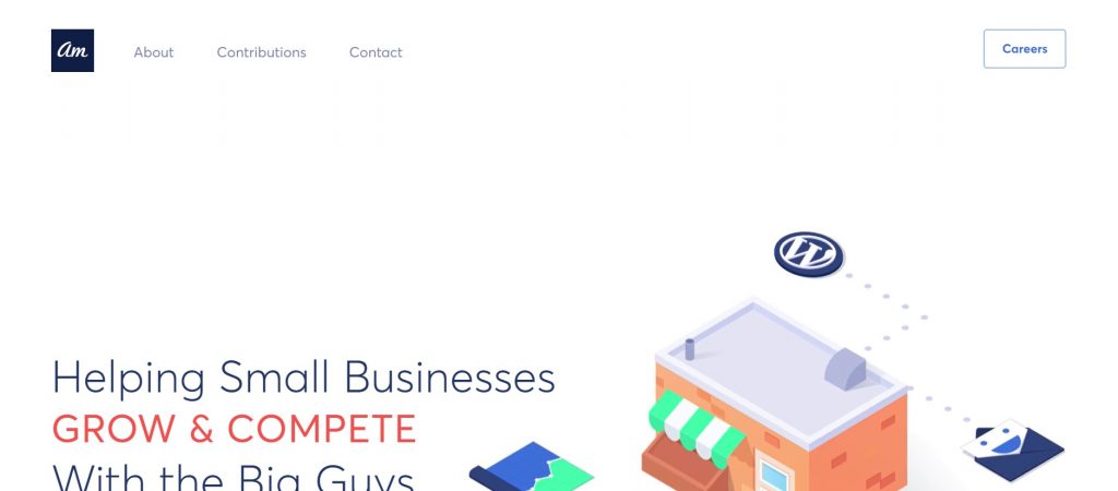
This website is one of the simplest, and basic, examples of a WordPress website that incorporates the parallax scrolling effect. The website banner is a cute animation of the products and services offered by the brand. Each component of the main area changes in color when the cursor hovers over it. The website has a minimalist feel but immediately lets the purpose and the use of the parallax effect is not, in any way, overwhelming.

Image Source: Awesome Motive
Studio Ouam
What is cool about this is that the logo at the header also has a parallax effect. The use of the animations matches well with the layout of the page. The slider is made up of images, where the description appears when the mouse is moved over it. What is cooler is that the title headings slide from white to black depending on the direction of the cursor’s movement.

Image Source: Studio Ouam
Mavericks Website
Using the mouse scroll, the website’s banner changes from stills to a video. The video has an overlay of team stats and game schedules. The sliders are also designed similar to the banner where the still image changes to videos with the movement of the mouse.

Image Source: Mavericks Official Page
Animal Logic Entertainment
It is not surprising that a creative digital company has a cool website design. The parallax effect on the website is not so overwhelming and feels seamless with the page layout. The Animal Logic logo is animated to transform from ANIMALLOGIC to MAGIC. The banner is also in video format, the galleries also change from stills to description with the movement of the mouse.

Image Source: Animal Logic
10×17 Website
The 10x website is a slideshow, showcase type of web design that features famous world artists and their favorite albums of the year. The entire feature is presented on a single page where all 10-day album feature slides into the screen with every scroll of the mouse. There is a lovely play of bright colors that artistically contrasts and blends.

Image Source: 10×17 website
Ceremony Coffee Roasters
A modern-minimalist designed website, the parallax effect creates an interesting modern and digital feel to the page. One of its most enjoyable features is a slider that changes in color and has a thermal-scanner-effect that follows the movement of the cursor.

Image Source: Coffee Ceremony
We Are Unconquered
Unconquered is a website that maximizes the functions of the parallax effect. The entire website is designed like a slideshow of videos and animation that changes and moves with the mouse cursor. For first-time visitors, the website could be a bit difficult to navigate. However, it seems like a strategy to force visitors to explore what the website could offer.

Image Source: Unconquered
Shape Studio UK
Everything on the website is animated and everything moves. The mouse cursor is being followed by a ring. The video on the banner has an optical illusion effect that activates when the mouse hovers at the center. The header portion of the website is also animated. The banner also doubles as a video slider, with incredible transition effects. One of its coolest features is a marquee of black and white words featuring their services. When the mouse hovers onto it, the letters become a bold color and an image appears on the cursor. This is pretty much one of the best websites that have parallax effects.

Image Source: Shape Studio UK

Cool Marquee effect. Image Source: Shape Studios UK
Jony Geudj Website
One key feature of this website is that it does not have a scroll at the side that would move the page from top to bottom. The page is not presented from top to bottom. Instead, the content is presented in a banner that doubles as a slider presentation of content. The page is navigated entirely using the mouse and the mouse scroll. Scrolling down moves the slider or gallery to the right and scrolling up moves the slider to the left. This is a very clever trick as this is an official webpage of a filmmaker. The page is designed like a video and moving through the content feels like editing a video – relying entirely on the scroll button and the mouse to navigate through timestamps.

Image Source: Jony Geudj
Amazonia Font Ad
Instead of using the mouse, the users are instructed to use their keyboard from letter A through Z. The website simply is an ad of a font where each photo features different ways to use and present it. This is a very interesting way with which a website interacts with users.

Image Source: Amazonia Font
Bonus
Here are other WordPress websites that feature the parallax scrolling effects:
The Cool Club

Image Source: Cool Club
Smart Chameleon

Image Source: Smart Chameleon
Also Read: The 10 Best Parallax Design Tutorials Ever
The post Best WordPress Parallax Scrolling Websites appeared first on SpyreStudios.


