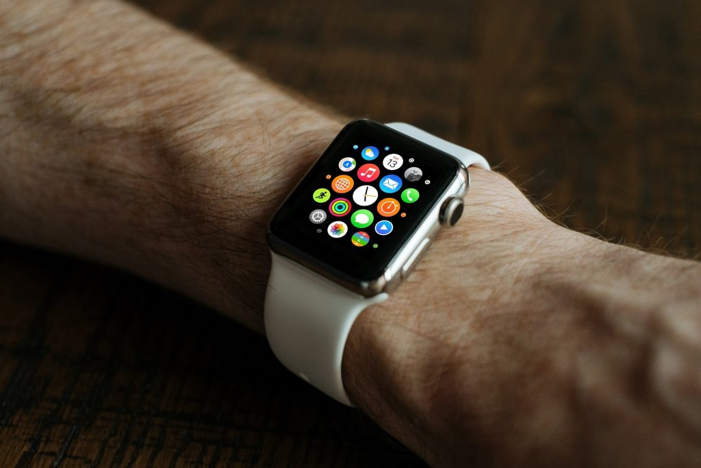
App icons have become a very important part of mobile applications. Years before, just a simple logo of the application program or its company would do. However, nowadays, app icons have been an important element of branding and marketing. If an app itself puts importance on its usability, an app icon’s purpose is to make the app recognizable and visible to people. We’ve listed down some of the best practices for app icon design below, and some examples that best exemplify what app icons are.
What Makes a Great App Icon Design?
The first thing we have to clarify is that app icons and logos are not the same. Both play a part in branding, but they are essentially different. Logos are defined as, “scalable vector pieces of branding designed for letterheads and billboards.” On the other hand, icons are raster images designed to look great within a square canvas and are designed for specific sizes. This means that the method of creating a design and the tools used for an icon and a logo are different. So on that note, what are the characteristics of a great app icon design?
Scalability
The first thing to keep in mind when designing an app icon is its scalability. Since the icon will be viewed in different mediums like an iPhone or an Android phone, a designer should take into consideration that the icon should look good in any format. Other than your phones, the icon should look good in retina-display devices, in the settings panel, app stores, and even your smartwatch. To ensure scalability, a designer should look at the design in multiple sizes and devices. To add, you should consider sticking with simple but unique shapes. Complicating the design will only make the icon look cramped in a square canvas. Before finalizing, you should also check out how your design will work against different colored backgrounds.
Recognizability
As mentioned before, an app icon should be recognizable. There are countless apps available in the market today and just in our personal phones, we probably have more than 10. To make your app stand out so that it’s easy to find, the icon must be something that you can recognize at a glance. Try to avoid complicated designs as people will tend to avoid them. Try to create different versions of your design and choose the one that catches your eye the most. Even better, ask someone from your target audience what they like best. If you’re stuck, try looking at your favorite app icons and analyze them to see what makes them easily recognizable.

Consistency
A great app icon design is also consistent. What this means is that your icon should reflect the app itself. When you retain similar elements of your app to your icon, users will find your app much more easily. You can do this by using same color palettes or incorporate similar design elements. Always make sure that the design you have for your app complements your icon, and is consistent with the image you’re trying to convey.
Avoid Using Words
This next characteristic should be obvious, but you still see some apps that do this. Don’t use words. Icons act as the visual representation of the app and using words defeats the purpose of that. Moreover, a square canvas is all you have to put your icon in. Using a mix of images and icons will just make it cluttered – and we don’t want that. Of course, this doesn’t mean that you should completely do away with letters. There are plenty of icons out there that use letters – and it works because it actually represents the app. Some examples would be the ‘f’ icon of the Facebook app or the ‘in’ icon of LinkedIn. Now, these letters are not read as words. These letters have become a representation of its apps.
Examples of Great App Icons
While we may have described what makes a great app icon, its really hard to understand it unless there are examples. Below are some of the app icons we feel really nailed what being an icon should look like.
Procreate

Discord

VSCO

DuoLingo

Pocket City

Audible

Tayasui Sketches

Monument Valley

FaceTune

Headspace

Netflix

You might also enjoy:
Best Mobile App Onboarding Screens for Your Inspiration
7 Tips For Designers Who Build Apps For Their Clients
The post Best Practices for App Icon Design appeared first on SpyreStudios.


