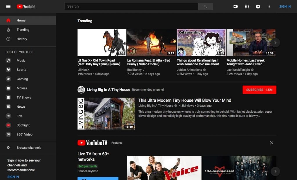
There’s a careful balance to be struck when adding customization options to your user interface. You need to provide a real degree of control, or dictate your design completely. Here are some things to consider when applying customization options to your user interface.
Theme Options
If you’re providing the option for your user interface to be customized, you’ll do well to think of them as themes. After all, a theme is nothing more than a collection of specific options preselected. By using themes, you give users the power to exert vast control over the user interface. It might be that there is only one theme. It might be that you can only offer one theme. But by bundling your preset modes as themes, you can always reserve the option of including additional customization options. Provided you create the framework for accommodating themes, you will always have the option to exercise that power. Without a unifying framework, you’ll find that many users are ill-suited to exercising customization control over the interface. They would often do well to see the results of a well-created theme.
Dark Mode

A dark mode or night mode is likely the most popular interface customization around today. This is especially popular on websites that host lots of text-based content. Some folks just prefer the aesthetic experience of light text against a dark background, while others find that reading on a dark background is less exhausting but others find it unbearable. So, if you do include this option, make sure you also provide a switch.
Dark mode shouldn’t just be black text on a white background. It should be approached as a separate color concept, designed on equal footing with the default color palette. Just like with the light mode design, the aesthetics should be based on hierarchy, content, and relative importance. It should help guide the user to the content they’re here for while producing as little frustration or confusion. Inverting your palette might be the first step, but it shouldn’t be your last.
Size and Typeface Options

In addition to options for adjusting the color of the interface, you should include tools for adjusting the size of text. While the zoom feature of any browser can enlarge text, it does so by also enlarging everything equally. This means that images are quickly blurred, and sufficient zooming can trigger media queries.
Text size options should be set by the user, with excessively small and large options. If you plan for the user to read considerable text, you owe them the courtesy of providing easy-to-read text. This can be as simple as a size slider, or choosing from a fixed number of options. You can also give users the power to specify the text size by point. Whatever you choose, take care in setting minimums and maximums. These values should be well beyond what you believe are the most useful minimum and maximum values. Not all users will share your same understanding of the compromises that make text most readable. Don’t let a lack of creativity in imagining the variety of your visitors make your site less functional. Give a wide berth for the user’s needs.
Reset to Defaults
Any good user customization engine needs an escape hatch. There needs to be an emergency reset switch, something that reverts the system back to a condition that guaranteed to be usable. It might remove the users existing customization, but it at least provides a known basis for saving something. Be sure that default switches provide meaningful fallbacks, with an inalienable “abandon ship” switch that provides a safe exit from the existing theme.
You can provide default rests both globally and for specific settings or sub-sections. A global default switch requires setting defaults for all values. Once you’ve done that, including one default switch per option isn’t much harder. Balance the complexity of the interface against the difficulty of returning the slider to a “known good” condition. If it’s very difficult to “recover” a setting or subsection to a fully functional condition, then provide robust default resets.
Keep Control Where It Counts

In providing customization options for the appearance of your user interface, you are essentially giving the user the power over the coat of paint atop the basic structure of the site. You do not want to give users complete and total control, as this is rarely necessary and provides the user with countless ways to completely immobilizing the content of all your heard work.
Do not allow the user complete control over the system. You need to carefully consider each decision you empower the user to make. If you expose every possible slider and lever, the adventurous user will quickly break your app. They might know its their fault, and they might not blame you, but they should never have the opportunity to break your work. Instead, they should be given customization options that have the potential of enhancing the experience of using the site.
Sometimes, additional options can broaden the audience of your site or app. Options that make the service easier to use—accessibility options, you might call them—should always be enshrined. But good design is good accessibility, and a well-formed structure will never impede the use of the site.
If you can provide color and text options that appeal to the largest range of users, those that need them will appreciate it. Each and every one of us can benefit from effective accessibility options, whether we are young or old, healthy or infirm. Accessibility is simply about making the interface most usable for you. That’s what all customization and display options should be bent towards: creating the most usable version of your website or app for the greatest number of people.
You might also like the following posts:
How Many Programming Languages Should I Learn?
Decoding HTML Status and Error Codes For Fun and Profit
The 7 Programming Languages Web Developers Need To Know in 2019
The post Adding Customization Options to Your User Interface appeared first on SpyreStudios.


