A coming soon page is so much more than just a practical placeholder for your website. When implemented mindfully effectively, it can serve as a launch pad for the entire online presence of your business.
By utilizing some of these practices, your business can take off with enough momentum to escape the internet’s gravitational pull.
Not convinced yet? Maybe these reasons will change your mind:
- A generic “this domain has been sold” or “under construction” page looks pretty horrible and can be seen as lazy
- A savvily made coming soon page is a great opportunity to build up an email subscriber base
- By at least launching your website in some way, you can start building on your SEO by getting your domain age ticking and being crawled by search engines
- You can use a coming soon page as part of your marketing strategy and to generate interest in your venture
So, without further ado, let’s see how you can make your coming soon page live up to its fullest potential.
First Impressions Matter
Before we get into more practical suggestions, let’s get them most important one out of the way: design.
You only get one chance at a first impression, so make it a lasting one. The first thing a user will notice about your coming soon page is how it looks. Before they read anything. Before they interact with it. Before they even think about what they are seeing.
It’s the same concept as going for a job interview. Even if you have the most impressive resume in the world, you might not get the chance to even present it if you show up looking destitute.
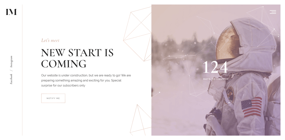
If you’re not a designer, and you don’t have the means to hire one, there are thousands of coming soon page templates with beautiful designs for you to pick from in marketplaces like Theme Forest. The only thing you have to do is slot in your own content.
Just have a look at this gorgeous example, Imbue from mix design:

Be Interactive, Be Engaging, Be Memorable
Since you only get to make one first impression, why not think out of the box and come up with something unique that visitors won’t forget? A gorgeous design and multimedia is a good start, but you can push the limits even further.
Just take a look at this example from Crypton Trading:

At first it doesn’t look like much, but visitors are in for a “wow” moment when they start scrolling and see the interesting effects. Putting the user in the driving seat and making them feel like they control the page is a clever way of drawing them in.
It captures the imagination from a creative and technical standpoint, while also delivering a superb introduction.
Link to your social media (and other) pages
More and more, businesses are realizing the importance of reaching their customers right where they spend their time online. As such, social media can be a great way to network, build communities, and generate interest for your project or business before you launch.
If you already have social media accounts set up, link to them from your coming soon page. This will give users the feeling that it is very much a “live” project. On top of that, social media is a great way to update users on your pre-launch activities and run promotions.
Since your coming soon page consists mostly of static content, you’ll want to direct visitors to somewhere you can engage them.
As an example, fashion e-commerce has become huge on social media sites like Facebook and Instagram. The founder of VENIM did a great job reaching out to her target market by setting up social media accounts and linking to them from her coming soon page:

Incorporate infographics
Although we cover multimedia elsewhere, infographics deserve a special mention. If you’re a content marketer, you should already know about the effectiveness of infographics. They are a great way to succinctly provide visitors with a tonne of information in an engaging, entertaining, and memorable way. The core thing here is to know what an infographic a successful one and what mistakes other designers make.
They are a particularly great tool if your business or industry relies on bringing across a lot of data and statistics. By combining graphical data with short snippets of informative text, you’ll be able to make your point without boring visitors with walls of text.
Some take this even further by effectively turning their entire coming soon landing page into an infographic. You can imagine an infographic like this being the perfect pitch for a security company, with a bit of modification:

Call to Action and Build Subscribers
It’s never too early to start building an email subscriber list. Not only is it going to be useful when your business is up and running, but it’s an effective way to give major updates pre-launch. While not everyone is crazy about them, a popular practice is a newsletter subscribe box that pops up the moment someone lands on your website:

To counteract any irritation on the visitor’s side, make sure to offer something in exchange or point out the benefit of being among the first to receive any updates.
Create (and Manage) Expectations
Disappointing users from the get-go won’t set a positive tone for your business going forward. So, how do you set realistic expectations? I’m glad you asked. Here are just two of the things you can do:
- Clearly highlight the problem you want to solve and present your solution without any embellishment or overpromising.
- Create a realistic timeline with highlights and important dates leading up to the launch of your business/project.
CSS Piffle did both of them in their coming soon page. The clearly highlighted the problem they wanted to solve using practical examples and presented a schedule of their launch trajectory with a cool timeline:

Trust is everything. Breaking it at the beginning of the relationship means it might never be repaired.
Introduce Yourself and Bring Your Brand Across
Since this will be the first time most visitors really get in touch with your venture, what better opportunity for a proper introduction. Whichever of the above practices you decide to use, the main goal should be to give visitors an idea of what you’re all about.
To that effect, make sure of the following:
- To provide a brief and clear, yet compelling, mission statement.
- That the design and voice are consistent with your brand and the end product of the website.
- Make sure that you already speak to your target market and show them you understand their problem(s) by presenting your solution.
A great example of how to do that is this inspirational coming soon page for an email client, Tinymail:

At the top, they clearly state who they are for and the branding is consistent with modern Mac-based applications.
Give your Website the Start it Deserves
Your website or business only gets to launch once, so make sure you can do so without any regrets.
By now, you should have the knowledge needed to pull off a successful online launch using a coming soon page. There’s no shame in learning from others and avoiding unnecessary work by reinventing the wheel.
Whether you’re a designer, content marketer, or entrepreneur; there are a ton of fantastic free tools to help you build attractive and effective landing pages.
Read: 33 Unique Eye Catching 404 Error Pages
Author bio – Melissa Burns is a marketing consultant, who occasionally also provides workshops for start-ups and small businesses. Melissa writes about digital marketing, web design and business innovation with the single goal of sharing her 6 years’ experience with other marketers. Follow her at @melissaaburns or contact at [email protected].
The post 7 Best Practices for a Coming Soon Page appeared first on SpyreStudios.


