Why do people run blogs? A long time ago blogs were just the spots online where people shared their personal thoughts and opinions, communicated with others (before social media took that niche).
Today even large brands can’t imagine their websites without blogs. One of the studies revealed that 36% of the Fortune 500 companies are using their blogs for thought leadership, product promotion and engagement. Blogs add more credibility to a business site and help driving traffic, acquire more leads and boost conversions.
To achieve all these benefits from your blog, you should make sure it has the best design and the most relevant and useful content. Then only you’ll get a stable amount of traffic and sales. Here are the essential elements of the page design and structure you should implement on your blog.
Good UX
Do you remember what Steve Jobs once said about design? “It’s not just what it looks like and feels like. Design is how it works.”
So put the user experience before the design and make the blog pages easy to navigate, its buttons – easy to click, and the posts easy to search. You should pay the most attention to the following elements:
- Clear navigation.
- Enough of white space.
- Search bar.
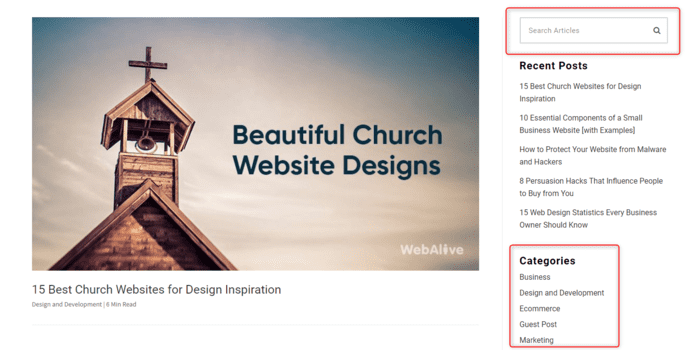
Your readers should have a clear vision of where on your blog they are and how to get to other pages. Make sure that each article and category page has breadcrumbs and the search bar is accessible from the Header. Limit the number of your blog categories to 10 max to avoid the mess.

WebAlive Blog
Put the search bar above the fold and make it clearly visible. People often may want to find other articles on your blog so the search box is a useful addition. Studies recommend making the search box about 27 characters wide, so it can include a few words that people may type in.
White space may be of any color, you know. The idea is that it should be a blank space that surrounds your text, images, buttons or other essential elements. It helps drawing attention to those elements, improve readability and focus on the important content. It also helps avoid clutter on the page.
Social Sharing Buttons and Commenting
Social media has become a part of our lives today. It’s a great way of spreading the information from your blog around the world and deliver it to your target audience. To make this process comfortable for users, you should have social sharing buttons on your blog pages.
With social buttons, people can share your blog posts in one click what makes it much more comfortable than copy-pasting the link to their status. Make the share bar scrolling with the text so users can share the post without having to scroll back to the top. Or put the buttons at the bottom of the post.
You can also add a Click-to-Tweet plugin that allows making ready-to-tweet extracts from your post. It makes it easy to share on Twitter and also improves the reader engagement. It’s one of the ways of content formatting that we will talk next.

Warfare Plugins
Add the Comments section under your posts. It should be easy to use and don’t require for people to fill out too many fields. Make it comfortable for users to leave comments either by signing in or by logging in with their social accounts.
Text Structure
Proper content formatting is a perfect way of boosting shares and engage users to actually read your content. Some earliest studies revealed that modern users scan the content, so your task is to catch their attention and make them read the article.
- Use readable fonts. Helvetica, Arial, Verdana, Trebuchet, and other sans-serif fonts make a great choice for long-form articles. It’s better to use percentages rather than fixed font sizes to make it more easily adapt to various screens.
- Create subheaders that attract attention and format them properly (H2 works well usually). Subheadings should clearly show what the user may read within the next section.
- Add bullet lists. They visually break the text into digestible chunks. People often skim through the list and may even read the entire article after finding something useful in the list.
- Put explanatory images, charts or graphs where it is necessary. Videos also help catch users’ attention while skimming through.
- Make your paragraphs short and only about one idea. Users will skip other ideas if they’re not stated within the first sentence of the paragraph.
You may also highlight the keywords across your text, but don’t overdo it. Bloggers used to believe that making their keyword in “bold” can somehow help search engines detect it and thus rank the article higher. However, there is no logical explanation or evidence that it may help you to get on the first page of Google. So use bold text only to draw the user’s attention to your ideas.
Internal Links and Related Posts
Internal linking is an essential part of the blogging. Links allow connecting your content and improve your SEO. They also help increase the time a user spends on your site. Internal links also make great means of site navigation that help users to find out more about various ideas that you already covered on your blog.
- Choose the content that “deserves” links. You shouldn’t link each word in your post that fits any other article on your blog. It’s better to identify your best content that already brings you traffic and start with it. Check out your Google Search Console and choose the articles with the highest traffic.
- Examine your blog for the content from which you can link those high-quality articles. Check out the keywords that bring you the most traffic, find those keywords in your articles and use them as the anchor text to link other posts.
- Find broken links in your posts and fix them. If the link doesn’t exist, you can create new content to link to it using the same anchor text. Or find other articles that can be a suitable replacement.
- Don’t overdo. Keep a smart ratio of internal links on a page. Up to four internal links in one article are usually enough.

Designmodo
Related posts section is another great opportunity to improve interlinking as well as to keep users browsing your blog.
Mobile-First Design
In 2018, over 52% of worldwide website traffic was generated through mobile devices. It means that people use their smartphones more and for multiple activities online including reading blogs.

Statista
And since Google announced it encourages sites to migrate to mobile-first indexing, you cannot stay aside. Check out your blog for responsiveness. You should optimize your images and fonts to look perfect on smaller screens. Put the crucial info above the fold to fit it into the smartphone screen and keep users on your page.
Now, Take a Look at Your Blog
There are more elements that bloggers may add to their designs, like the About section in the sidebar that helps readers learn more about the author. Or the email subscription field that encourages users to subscribe and helps boost the number of readers for your blog. It also helps get more leads for Ecommerce blogs.
It’s up to you what elements to add, but without the essential ones, your blog will hardly make it to the Top of Google.
Author Bio
Helen is a content marketer at Ahrefs. She explores new things every day to impress her readers with catchy stories. Apart from all that marketing stuff, Helen loves listening to rock music, reading and traveling. A lot! Feel free to follow Helen on Twitter.
The post Essential Elements for Blog Design appeared first on SpyreStudios.
Powered by WPeMatico


