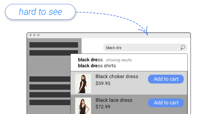
The search bar is one of the most useful features on your website. It can help visitors find exactly what they’re looking for with just a few key presses. On a typical ecommerce website, search users convert at a rate 3.5x higher than those that don’t interact with search, so it makes sense to use your design to encourage searches.
Unfortunately, in the recent quest for clean and minimalist web design, the search area has been deprioritized, and is often hidden unintentionally. Check your site against these best practices to find out if you could be getting more from your search.
How to Optimize the Design and Location of the Search Bar
1) Text box
As mentioned above, many sites are seeking clean designs. One of the ways this is achieved is by softening and minimizing the color palette. So if the site’s header has a green background, the search bar will often use that same color. Sites with white backgrounds often go for search bars with an eggshell color to make them easier on the eyes.

This is visually appealing, but tests show that it makes it harder to see the search bar. Even when the user does see it, colors other than white (especially grey tones) can subtly indicate to the user that text entry is blocked.
According to our report:
“Sites with entry fields that were any other color saw usage of 4.79%, while sites that used a white text entry field (even on a white background) saw usage of 14.57%.” – SearchSpring

To summarize, using a white search bar background (or entry field) on colors other than white increases contrast with surrounding elements, but also lets the user know that entry is available.
In addition to the color inside the box, the sample text inside the box is also an important visual aid. While our tests only saw a 2% increase in overall search usage by including this text, it can help in other ways. In addition to the traditional “search” or “start typing”, the sample text can be used to tell users how to search.
If your site supports searching by SKU or product number, for example, you can use text that indicates that, such as “enter keyword, SKU or product number”.
Amazon does this effectively after the user starts typing, showing users that they can search within a category. If your site allows such advanced searches, it’s a good idea to provide visual cues to inform the user.
2) Contrast
Contrast has already been discussed to a degree, but there’s a lot more to say on the subject. In addition to using a white text entry field on non-white backgrounds, there are other ways to increase visual contrast.
Many sites are now incorporating the search button inside of the text box. Again, this is attractive but doesn’t help the search area stand out from the rest of the page. Including a search button with a contrasting color (which is extremely useful in web design) will make the search area easier to find.
Another way to help surface the search bar is to add a high contrast border, and perhaps even a drop shadow.
One of our clients followed these best practices and was able to double their search usage immediately following the changes.
Before

After

You can, no doubt, see how much easier it is to find the search bar among the other elements. In the before picture, it was very hard to distinguish from other items. To be fair, this also has a lot to do with the chosen design language as all the other header buttons are white rectangles with white text and icons.
3) Location
The location of the search bar is increasingly important. As search is getting smarter, it’s being brought closer to the front of many designs. Even in the operating systems we use on our desktops, laptops, smartphones, and tablets, search is becoming a huge part of everyday UX.
Voice search is evolving at a rapid pace with new smart devices and is resulting in the popularization of devices that don’t have screens at all.
It’s important to take note of all this because users are now expecting to be able to search more than they used to. In the past, hiding the search bar in the hamburger menu might have been acceptable.
As you look at the evolution of e-commerce, you’ll notice a distinct trend among the top internet retailers. Take BestBuy, for example. Just a handful of years ago, the search box was small, and could easily be missed.

Today, however, it takes a prominent position right next to their logo, is much larger, and contrasts heavily with the background.

In our testing, we found that central placement was the best location for increasing usage.
“Center placement resulted in 15.86% search usage, whereas top right delivered 13.43%. Top left was, by far, the worst option with just 7.72% usage.”
If the goal is to increase search usage, the most prominent location is definitely going to be best. Whether or not that fits into your current design, is another story. Some layouts will make it hard to place search in the center as this will take up more vertical space when compared to the traditional header search. However, this is something worse considering when you redesign your homepage next.
Overall, minor adjustments to the design of your search bar can drastically increase how frequently it’s used. Be sure to look into ways to make your search bar better, so that your customers will find the products they want more easily.
7 E-Commerce Design Boo Boos
This post was written by Lane Fries, the digital marketing strategist at SearchSpring, an e-commerce site search provider. Specializing in e-commerce marketing techniques, Lane creates content to help retailers improve their site’s shopping experience.
The post How to Optimize the Design and Location of the Search Bar appeared first on SpyreStudios.
Powered by WPeMatico


