Email marketing has been rumored to be dead. Don’t believe that just yet. People still read emails. In fact, 80% of retail businesses say that email marketing is the number one customer retention, according to eMarketer.
There are many factors for when an email is considered “good.” But right now, let’s talk about design first.
If you’re a business, you need to be able to design your emails with style. As competition grows endlessly, your emails must capture attention in a single glance, or you risk getting your email ignored and deleted.
Here are some designs that will surely light up a bulb and inspire you to make your own.
1. Keep it simple
In some cases, simple designs can be more than a lot. Meaning, it shows everything that’s needed in the limited space available.
However, being simple doesn’t just mean that you use two colors or a single font, it should also be relative to the message of your email.
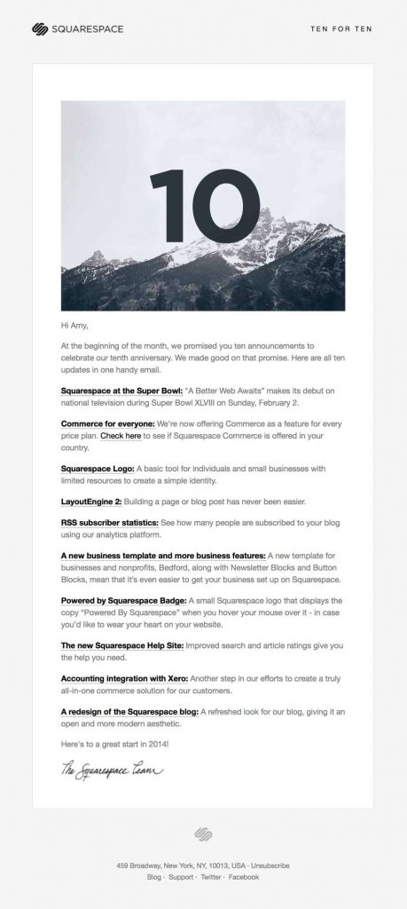
Say for example this email design by Squarespace.

Notice the single image used, the color palette, and minimal font types. It’s straight to the point and delivers the message efficiently.
If you want this kind of email, start by subtracting some parts on your emails little by little instead of adding more.
2. Have fun with colors
Keeping emails simple is one thing, but you can always experiment with different colors and see which would be more useful. Also, adding colors should be related to what email you will be sending out.
This announcement email from Hoefler and Co. about their newest typeface shows a group of colors that complement each other. It doesn’t look forced, and it’s a fun thing to see in your inbox.

Another example is this email from Anthropologie. Although most businesses use eye-catching colors, this one used light ones with a combination of orange colored texts. Plus the creative photos of their products are delightful to look at.

3. Make it balanced
What is the right email template? The answer is it depends on your content and on what you are trying to advertise. But do know that your email should be balanced between the texts and images.
Creative Market’s email seems to be perfect at this one. Look at how they had fun with colors but still make it look simple and elegant.

Too much and too less of the both might not be an effective marketing. Simplicity plus creativity are the right ingredients to make your email’s template balanced and more appealing to your subscribers.
4. Try using animations
Animations for your email marketing is a must try as this engages people more rather than by just using simple images. Remember that including animations to your email does not require it to cover your email’s contents or to show how much you care about your consumers. Rather, the animation is purely for creativity and fun.
When we say animation, it could be as simple as this email from Milled.

Bringing the element of creativity in your email is an excellent way to attract more people.
5. Use only important texts
Too much information can lead to confusion. When constructing your emails, remember to make it short but concise. Use and include only the words you want to express to your consumers and try to avoid any unnecessary texts that would take much of your reader’s time. Nordstrom‘s welcome email is precisely like that. Notice the short and precise message and ending it with three buttons that will lead the reader to their website.

Furthermore, focus only on what you want your readers to know and not on complicated and lengthy texts.
6. Show visual hierarchy
Using numbered items or connecting lines is also a nice touch. It makes your content easy to follow and leads right to your CTA button.
This iTunes email show a collection of information that is easy to follow. Both emails obviously tell its reader where to begin reading by carefully displaying the content vertically for easier skimming.

7. Lessen calls to action
Calls to action are essential to invite action. But keep it minimal. It should already be obvious to readers what you want them to do.
This newsletter from Starbucks maximizes the power of simplicity along with good visuals. You can see the straight to the point intent of the email and directs where to click exactly.

8. Make it urgent
Using a huge font and attention-grabbing color, this email from Jack Spade is a nice example of bringing out a sense of urgency to subscribers.

Urgency is a compelling aspect of human psychology. Once you know how it works, you can influence people to act quickly and do what it is that you want them to do. Here’s an excellent resource from Campaign Monitor that explains how using deadlines and the proper call to action language can significantly increase conversion.
9. Get personal
Emails should be as personal as possible. Aside from the usual mentions of their name, marketers should stand out and use other strategies that will enhance the probability of your subscribers to read through your emails.
Look at how journelle personalized their email by sending a birthday greeting and giving out a custom discount coupon.

If you own an online store, sending out emails about abandoned carts like this could get people to re-engage with your brands once again.
When you have information about their interests, location, and shopping activities, it’s easier to send out a personalized email and get them to connect with you.
Conclusion
There are a lot of email designs to fuel your inspiration. Hopefully, the samples above will get you to create something that is perfect for your own business. Here’s a checklist for when you need more guidance to start your own email campaign’s designs.
As always, you will need to find your style so make sure to experiment with different designs and be creative.
Remember that you are also doing this for your subscribers, so make it desirable for them. Have fun with your next email campaign!
The post 9 Email Design Inspiration for a Killer Campaign appeared first on SpyreStudios.
Powered by WPeMatico

