Web design trends aside, some things stay constant for a corporate or business website to stand out from among the hundreds and thousands in its industry. It must be contemporary, with a cutting-edge design that is appropriate for its business. It must provide a great user experience, a responsive design or a separate mobile site, have integrated social media icons in all pages, and a conspicuous call to action button.
1. Revols

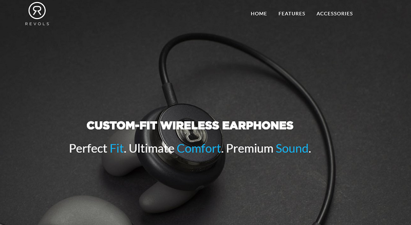
Revols, creator of wireless customized earphones, has its magnified earphones on its homepage, designed to captivate its users to its only product. Its color palette is minimal, giving prominence to its typography and succeeding in capturing its users’ curiosity. Its instructional video adds to the focus on the product and gives users a peek into the experience of its earphones.
2. Creativity is in the Air

This film website is an interactive hub that its parent website, Eva Air, presented at the start of its North American campaign. It sent three people in the arts industry to Taipei and filmed them conceptualizing in-flight. The scenes in the video are a powerful and innovative communication tool that’s starkly different from static pages. The film is stirring, as travel usually is. Improvements in the loading speed can make a big difference in retaining users’ attention.
3. oollee

Designed by Russian agency Red Collar, oollee is a water provider based in Silicon Valley, CA. The aqua-colored website has a clean look, with an image of a human being continuously dripping water. Blue and green, the site’s main colors, bring to mind water, cleanliness and environment, which are appropriate for its product. It got high points from CSS Design Awards and awwwards.com for its user interface design and innovativeness.
4. Cryptocatch

Cryptocatch is described as a “curated index of the best free cryptocurrency airdrops.” Its white typewriter font on a black background denotes power, strength and unconventionality, and the mystery associated with cryptocurrency is demonstrated in its design. It’s also a come-on for risk-taking investors who play the market using traditional methods or robinhood trading.
5. Iconinc
A luxury all-inclusive student accommodation with housing located in Leeds and Liverpool, the website relies on compelling images of its houses and rooms exuding the warmth and comfort of home. It has an asymmetrical grid layout and dynamic pages that contain shots of the interiors of the houses. CSS Design Awards scored it high for user interface and user experience.
6. JVEB Studio

JVEB Studio is a France-based agency that provides short content for brands and advertising agencies, has a striking and clean website with sharp contrasting colors that make small images pop. Its animation of illustrations is impressive, and even with its French language that doesn’t offer translation, it is an attractive and well-designed site.
7. Maman Corp

A US-based construction company, Maman Corp’s focus is to optimize and improve business structures. The website’s dynamic background is a view of its business, which is optimizing structures. The sharp static layouts in red and white provide information about the company. Its moving pages within a page give the website a clean contemporary design.
10 Web Design Layouts For Service And Business Websites
The post 7 Top Corporate and Business Web Designs appeared first on SpyreStudios.
Powered by WPeMatico


