There are basic usability heuristics all designers know and live by. Why? Because designing for usability takes up more complicated planning processes than it looks. Contrary to most people’s thinking, UI and UX design is NOT about the aesthetic. It’s about creating a workable, and successful, path for users on an interface from the moment they open a software or an app up until they close it. It’s expected that there is ease and pleasure to their experience.
How do designers know what to do? Simple – by statistics. All UI and UX designers follow basic “common knowledge” for their process. Most usually, it is the usability heuristics for computer design introduced by Jakob Nielsen in the 1990s. These “heuristics” are introduced by Nielsen as, sort of, rules of thumb rather than a standard. We follow these heuristics because, by statistics, they work.
Let’s divide up the characteristics based on a category and see how we could use them for UI and UX design:
A look at the interface
Minimalist aesthetic
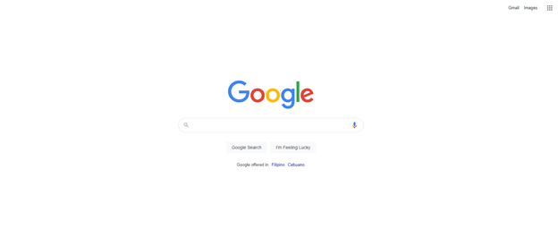
There is a rule of thumb that the nicer an interface looks, the more pleasurable the experience is going to be. But, on top of that, an interface should include only elements with the highest informational value. The best example would be the Google home screen. It is simple and basic, does its job, and, reduces confusion in users.

Minimalist Google Search Page Source: Web Screenshot
Relateable to the real world
This is easy to understand, the system should use the users’ language in ways that it is familiar to them.
Dealing with errors
Follow conventions
This is where conformity to standards is important. If we follow standards and conventions for our design, it will be easier for users in a lot of aspects. Getting lost in a website can be daunting.
Recovering mistakes
No matter how hard we follow conventions, there will come a time that our users will make mistakes, or simply change their minds. For this, the option for recovery must always be available for users.
Creating a “user help” page
Every website has a FAQ page where they normally get answers to normal inquiries or issues. Make sure that whatever you design, a website, software, or an app the user help page is easy to access for all users.

Help Search Bar from Fiverr Source: Web Screenshot
Designing for navigation and usability
Informing users of status
More than we think, the user’s knowledge of the system status is vital to reducing their confusion. Providing feedback within a reasonable time frame (as a result of a prior action) is essential, as it is directly associated with the next step or action.

Progress indicators are necessary for any design
For instance, when uploading or downloading a file, users must be informed whether they need to wait or continue. Status pertains to a lot of things. It could be, say, an update to software that could affect usability. Or, simply, a notification or indicator when your mobile phone memory is nearing its limit.
“Recognition rather than recall”
This is basic – a user is not expected to remember information from one activity to another. All instructions for use should always be easily retrievable or visible. Visual cues are essential for this.
For instance, all interfaces for Android mobile phones have similar icons, gestures, and interfaces regardless of the brand. This makes shifting from one phone model to another easier. Another example would be “adding to cart” or “adding a wishlist” on an e-commerce website makes buying an item out of stock or out of budget for now, easily retrievable.
Also, Read 24 Free Thanksgiving Banners You Could Use For Your Website
The post 7 Basic Usability Heuristic Designers Live By


