American historical websites are not that many, to be honest. We have just recently celebrated America’s independence day and it is so inspiring to see nationalism and patriotism all around us. If you are tasked to design one, there would seem to be no standard and the entire page is simply your canvass. There are many ways to create designs that would represent American history. And, there is also an unlimited bank of ideologies, principles, and even people, to be inspired by. The richness of American history is, in itself, a great source of inspiration.
Here are a few of the impressive American historical websites for your inspiration:
Gilder Lehrman

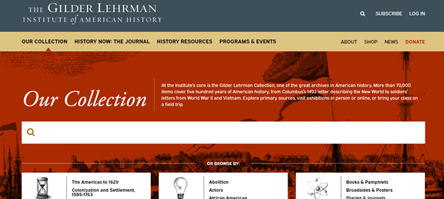
What is more patriotic than a blue, gold, and red-themed background right? The theme is just plain gold on a white background on other pages within the Gilder Lehrman website. Font style and color are also basic at white and black.
Yellow tones are a tough choice for digital designers. Brighter shades can make the design straining for the readers and darker tones make the website look dull. The choice of this subtle gold color for the banners, the menu bar, and the footnotes is a rich choice. It gives that historical ‘vintage’ feels to it yet makes it more classic.
Time Maps

How else can we design a map website without a vintage globe, a compass, and an explorer-aged telescope? The background is impressively coherent, combined with hues of brown and gold. Even if there are so many details and elements within the background, it does not look cluttered – this is what good photo editing can do!
What is impressive about this website is that it stayed true to the ‘time map concept. It shows the readers a map of the US (and the world) at certain periods. There are pins on prominent locations that readers could click and they would be led to more detailed descriptions of the map.
The Smithsonian – National Museum of African American History & Culture

This is the ‘standard museum website’ design we often see in a lot of historical websites. There’s the black banner for the menu bar, the white background, and an impressive photograph for the main headline.
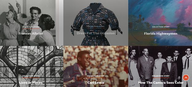
However, moving through the website’s pages, you will be surely impressed by the layout. Since we see a lot of history through photographs, the designer made sure to feature that. It catches the readers’ interest and creates this majestic collage.
Our Whitehouse

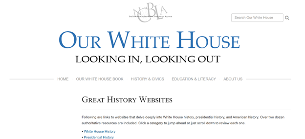
This is a website for children’s books that features the White House and its history. The design of the website is straightforward and minimalistic. The background is white, the texts are black, important links are blue. The main header is of a soft blue that has great contrast with the white background. Somehow, the website feels serious and educational. If you want to know why it’s probably because its design is very reminiscent of the Wikipedia page.
It is important to note that this is a website created by National Children’s Book and Literacy Alliance. The probable audience would be teachers and students – which is why it might have been a better idea to incorporate some graphics from the book.
Big History Project

A common design mistake is to be boxed into a concept in hopes of being coherent with the website’s theme. When we say history, it is often related to old books, old maps, old globes, and old anything! This is why it is a surprise why the main page of the Big History Project features a couple of dolphins.
This is a bold design move and it does represent the idea of the website pretty well – history is all around us and we must protect it. History is also about the Earth and its inhabitants, not just humans.
Also read: 8 Best Stylus for Web Designers
The post 5 Impressive American Historical Websites


