Design principles can be applied to any visual medium – and videos are no exception. In fact it is essential that you consider the design of the elements in your videos if you want them to look impressive.
While there are many design principles that you should take into account, there are four in particular that videos should definitely leverage if you want them to have a strong impact.
Contrast
In simple terms contrast is involves using elements that are the opposite of each other to make a design more visually interesting. Every design should use at least one instance of contrast, otherwise it is likely to look dull and won’t attract the attention of viewers.
It is important to note that there are many types of contrast. The most widely-used type is contrasting color (i.e. black vs. white, light vs. dark), but you could just as easily contrast size, shapes, styles, and so on.

As far as videos are concerned contrast can also be applied via movement – where elements that are moving will contrast against static elements in your video.
Important elements in your video should contrast against the rest of the video, so that viewers are automatically drawn to them. The greater the contrast the more likely viewers are to gravitate towards those elements.
Balance
Comparatively speaking balance is one of the trickier design principles to handle. It is best to think of it as a way to structure and distribute elements in the frame of your video so that they appear stable.
Sometimes you may not want your video to look stable however, and may opt to use an unbalanced design instead. That will let you foster a more dynamic feeling, but at the same time you risk drawing attention away from important elements and causing shifts in focus.
Often videos are designed so that the background is balanced, but the subject and other important elements are not. That can help them stand out further, and create focal points in the areas that you want viewers to look at.
Composition techniques such as the rule of thirds can help you to create more balanced videos, by providing you with a guide to distribute elements more evenly in the frame.
Alignment
One of the more useful design principles for videos is definitely alignment – and it basically involves lining up elements to connect them visually. With the right approach alignment can help to structure the elements in your video, and give viewers a natural order in which to view them.
While it may sound complicated, alignment is actually an easy principle to apply. For example you could align text in a straight vertical line and viewers will automatically read it from the top to the bottom. Proximity is important to alignment however, otherwise the connection between elements won’t be nearly as strong.
Rhythm
Static designs often place greater emphasis on patterns, but for videos the rhythm is a far more important design principle. Like patterns it involves repeating certain elements, but it is more dynamic and less uniform than patterns would be.
Rhythm is a principle that can be applied to many parts of your video, including its pacing, music, and overall structure. One of the easiest ways to create rhythm visually in a video is progression – such as by taking small elements and gradually making them larger, or increasing the intensity of an element’s color.
For pacing rhythm involves establishing patterns in terms of how you cut your video. Alternating long cuts with short cuts, or having a series of long cuts followed by a few quick short cuts can be a good place to start developing rhythm in a video’s pace.
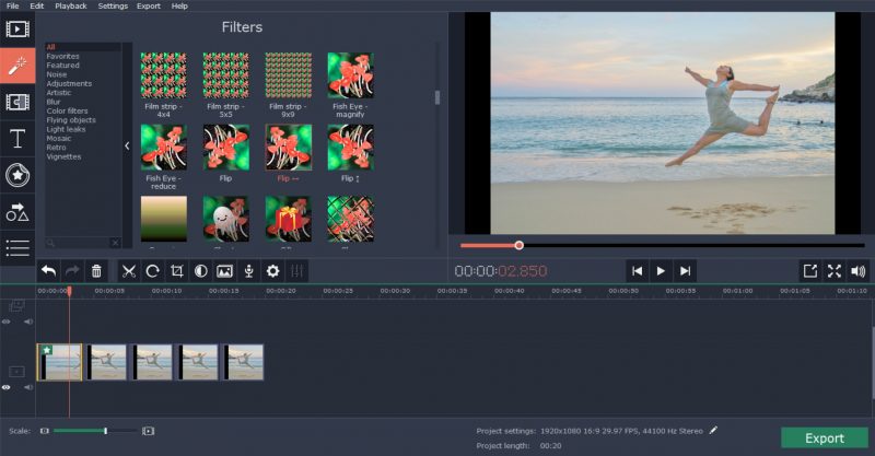
In some cases applying slow motion effects to your video can create a rhythm as well. For example you could use Movavi Video Editor and follow the instructions at https://www.movavi.com/support/how-to/how-to-slow-down-video.html to give it a try.
Conclusion
Starting to see how important design principles are to videos? The four listed above should give you more than enough to cut your teeth on – and if you’re interested you can look at other design principles that could help you improve your video further after you’re done.
The post 4 Key Design Principles That Videos Should Leverage appeared first on SpyreStudios.
Powered by WPeMatico


