Choosing a great color scheme may often become a rigorous choice on each web project. You want to make sure the colors fit with the branding and, hopefully, don’t overpower the content. Grey and silver are often portrayed as dull – and at times pushed into the background. However, these colors can, in fact, bring a sense of solidity and strength to your design. It all depends on what else you mix into the site and how the layout is structured. Take a peek at these examples and think about how you might try including one of these colors in future palettes.
Smart!
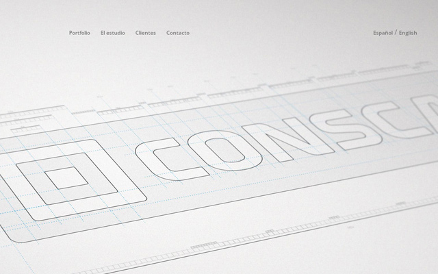
My Own Bike
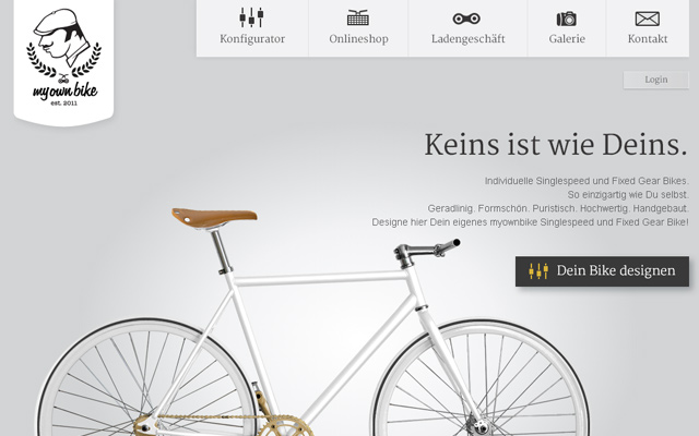
Laurent Perez Del Mar

Sang Han

David Mcmenemy

The Ordinary
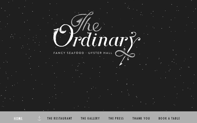
Chylak

U.S.A.F. ECHO

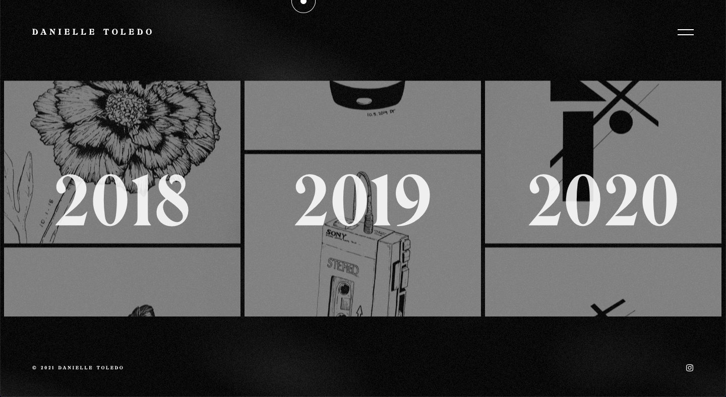
Danielle Toledo
Gabriel Norman

Delaunay

Mouton Noir

Sturdy

Hanai World

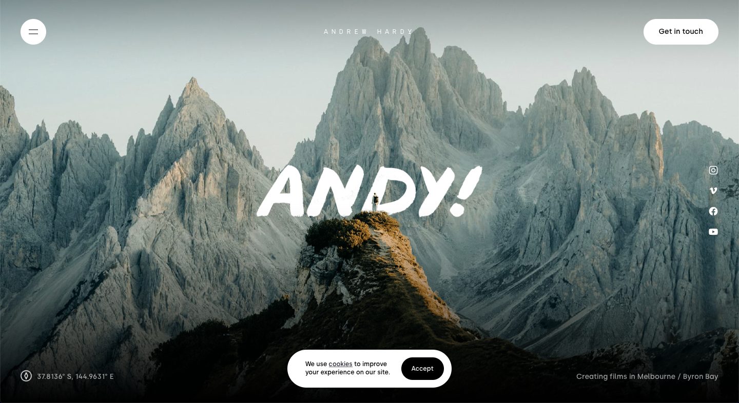
Andy Hardy
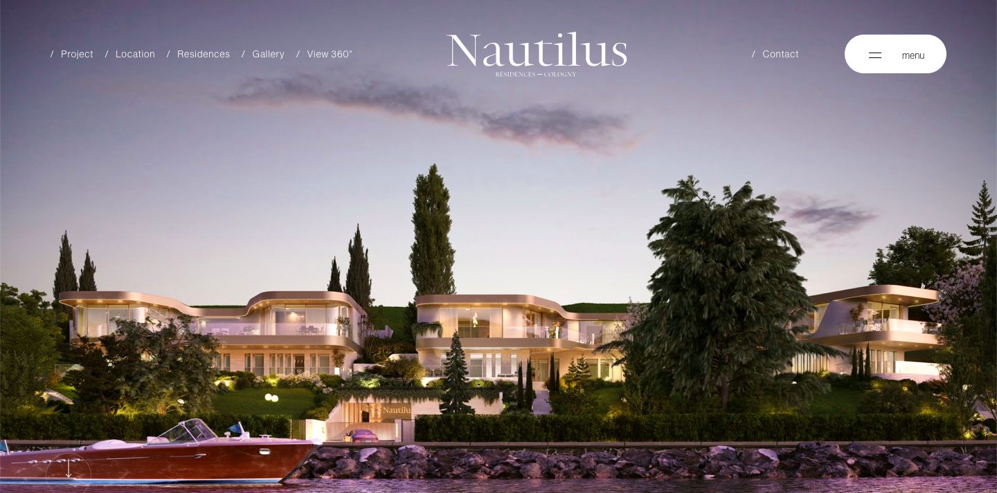
Nautilus
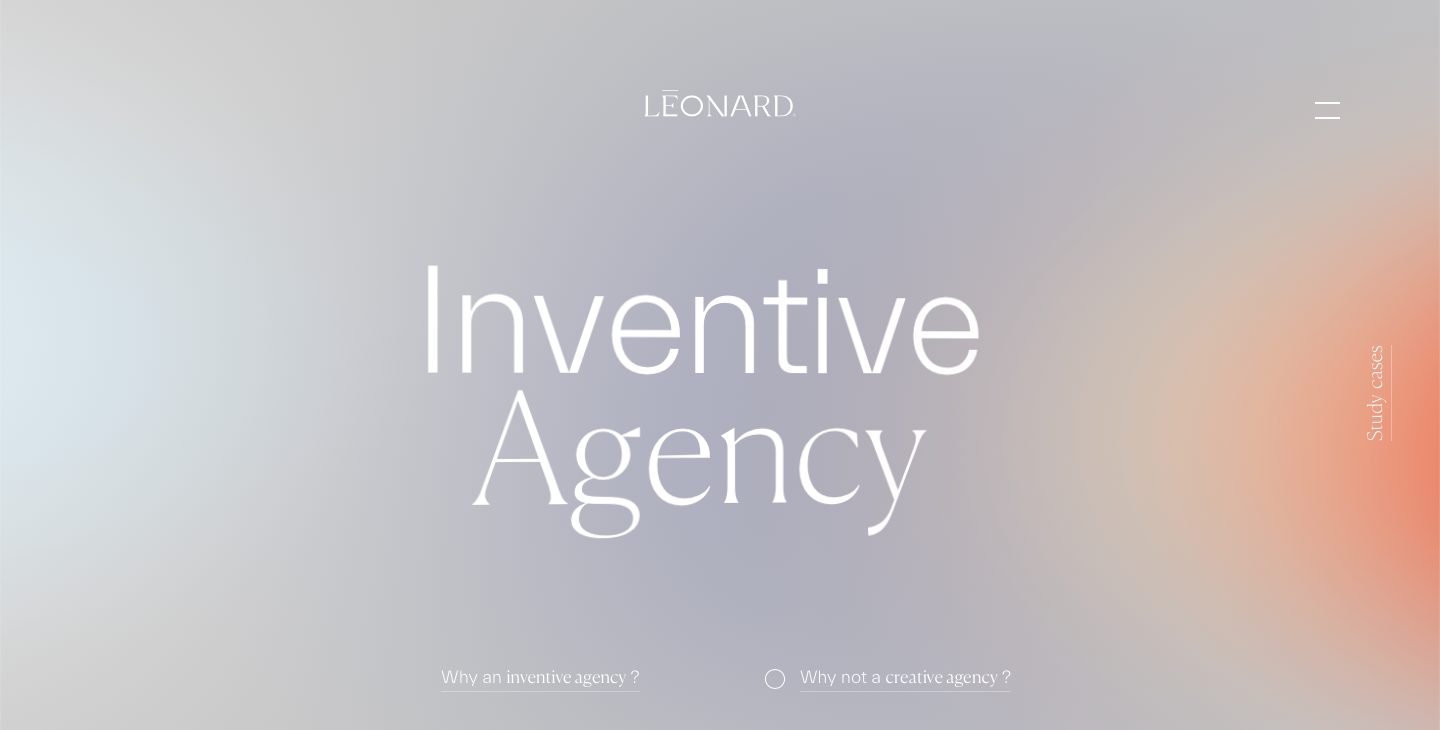
Léonard
The String

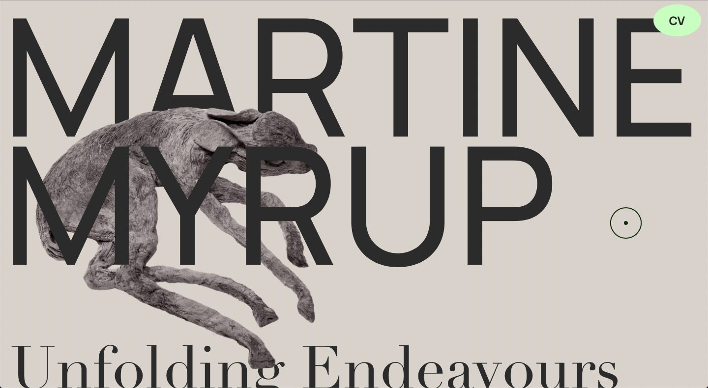
Martine Myrup
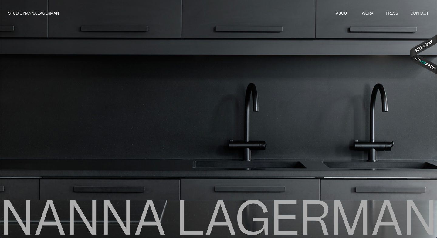
Nanna Lagerman
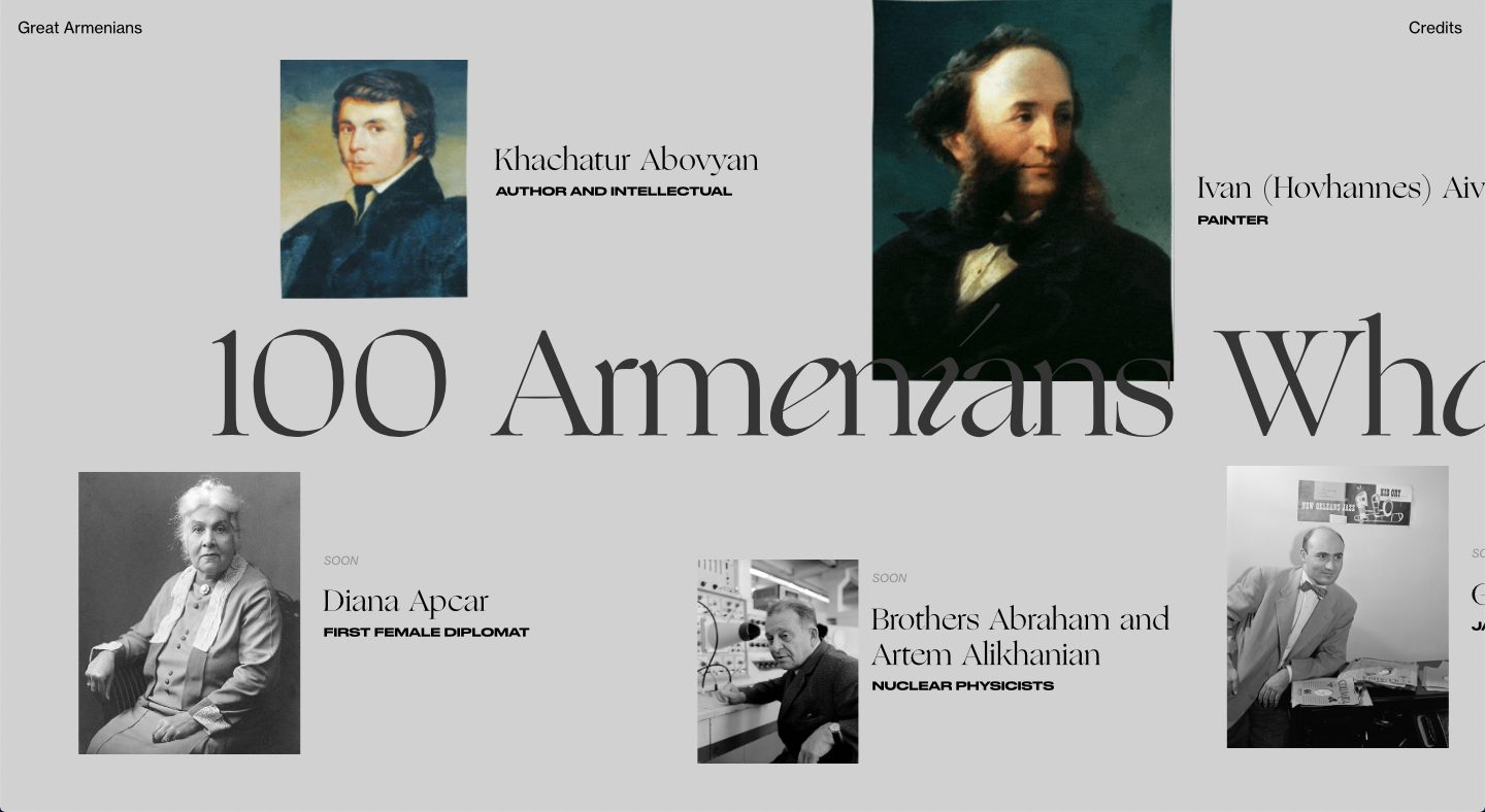
100 Armenians
Marta Verba

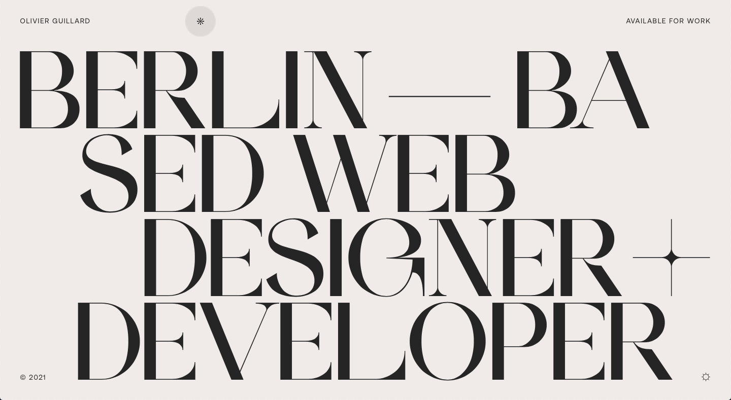
Olivier Guillard
Jesus Originales

Impermanence

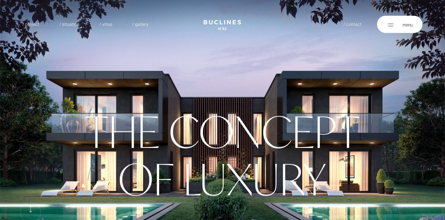
Buclines
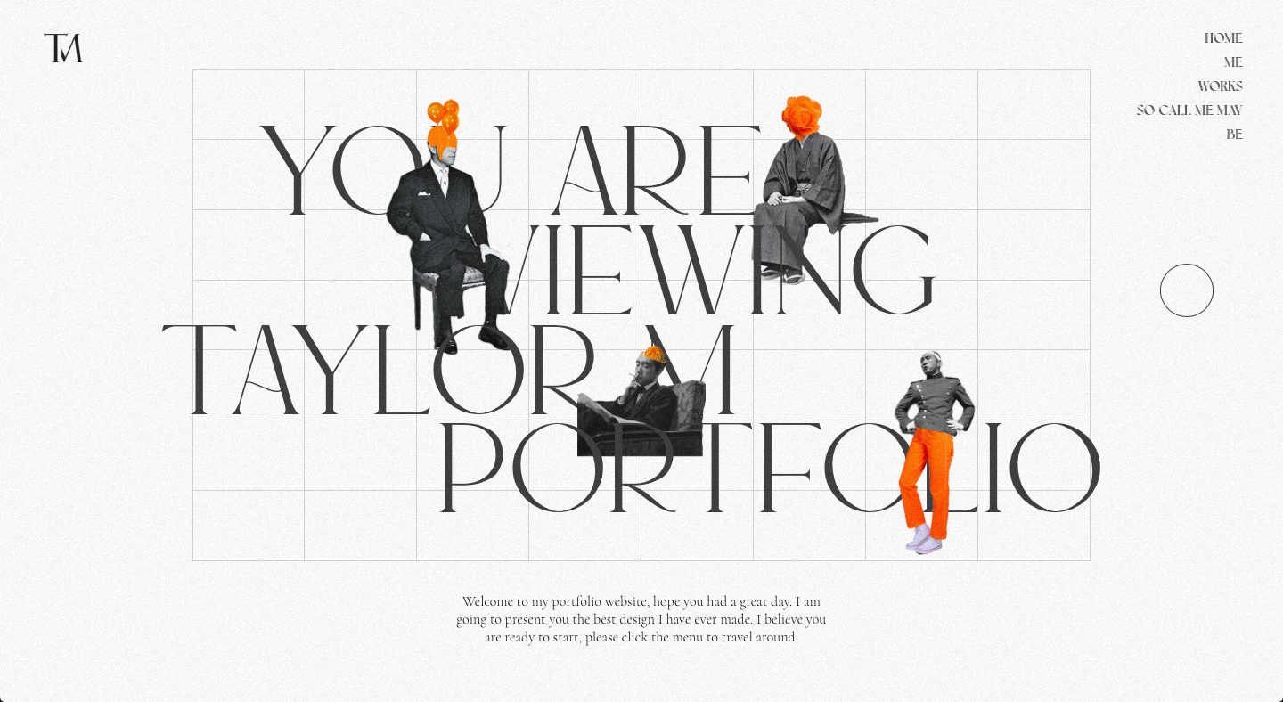
Taylor M
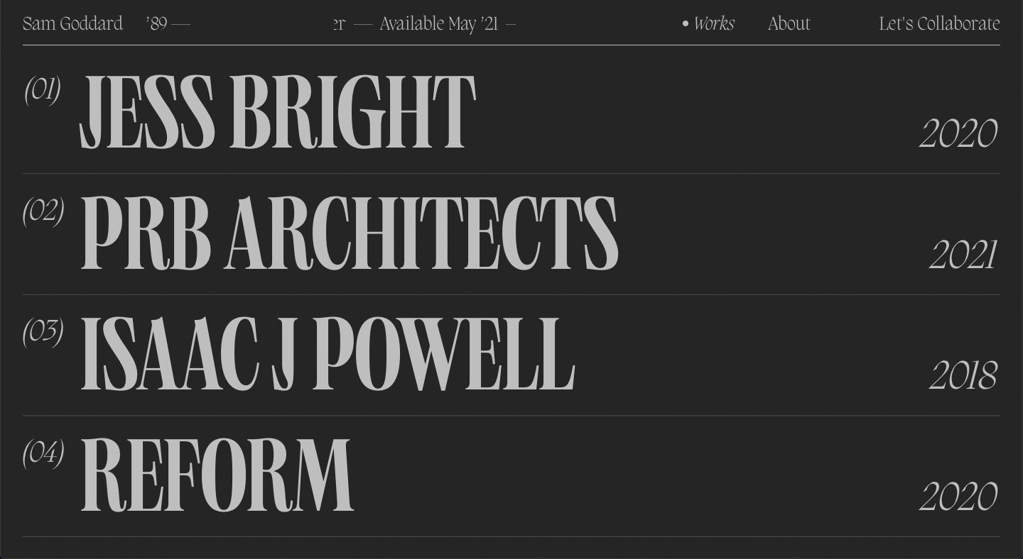
Sam Goddard
The Highloft

Add Culture

The post 30 Grey & Silver Website Layouts for Design Inspiration


