There are numerous brilliant Shopify store designs in the world. Shopify, one of the most popular e-commerce platforms, is a go-to CMS for store owners and brand managers. The user-friendly management system, the customizability, the variety of design options, the thousands of themes – these are just some of the reasons why designers prefer offering Shopify as a platform for their clients. Even better, Shopify has an impressive payment and delivery system that makes it easier for the product owners to market, sell, and ship their products.
One of the main highlights of using Shopify as a platform is the customizability. No two Shopify store will look the same as there are thousands of variations designers can do even with a single theme. To showcase this customizability, here are some of the good-looking Shopify stores on the internet:
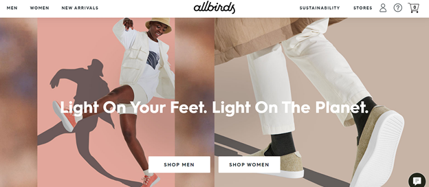
All Birds
Fashionable yet sustainable, this is the company’s goal. This fact, in itself, is what makes the Shopify store brilliant. Other than that, what is great about the website is the contrast of color used. The nudes against the whites bring out the color of the product. Impressively, the background color is monochromatic with the product in almost every photo.
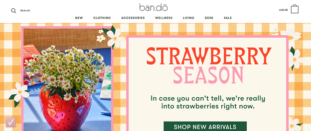
Ban.do
Texture is such a big thing for this website, who knew a bright yellow checkered texture would work great with the website? Through out the Shopify store, even in photographs, texture played such a huge role in enticing users to continue scrolling through.
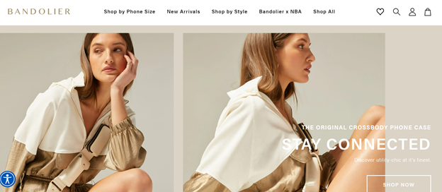
Bandolier
A monochromatic gold theme is all it takes to make this entire Shopify store luxurious. The way they used the palette is so subtle, it is quite difficult to notice.
Boat
Ever saw something so aggressive and straight-forward but you can’t stop looking? This is a Shopify store for that. The bright red-black palette may seem overwhelming, but it works.

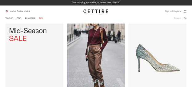
Cettire
The website is very simple. There are just four menu options – women, men, designers, and sale. That’s it. This makes browsing easier and keeps the customer on track on one thing – buying.
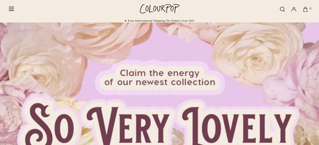
Colourpop
Floral never really worked on a lot of websites but somehow with the soft pink and rose gold, ColourPop did it. The layout of the website may look too designed with the large rosettes, and too much images to look at all over the place, but still the design highlights the products really well.
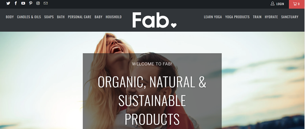
Fab
This is your typical ‘close-to-nature’ design. There are plants, dried petals, and wood all over the place. Pretty true to the products though.
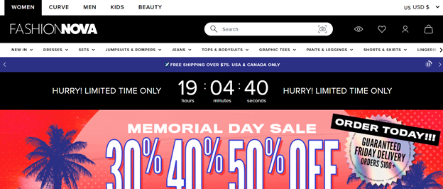
FashionNova
This is your typical early 2010s, but website design but it still works. Big and bold letters everywhere, bright color palette, and a crazy layout. It is a step away from the current minimalist trend but still the design works out great.
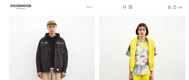
Good Hood
Minimalist – makes the customer look at the product instead of the model or the website.
Lunya
One of the best things about this Shopify Store is the copywriting. The Shopify store is bold enough to create fun in presenting their products.

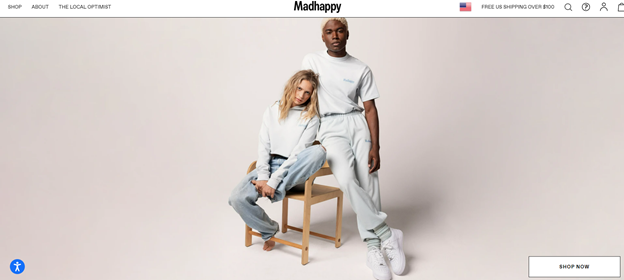
Madhappy
Yes, sweatshirts and sweatpants are so on-trend right now there are Shopify stores entirely for selling them. The best part is, the website design makes it look so casual and desirable.
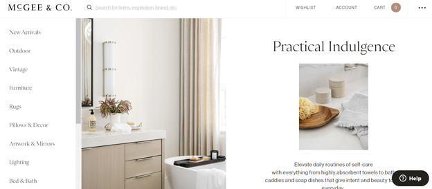
McGee & Co
We love that everything in this website is either white or neutral. It is relaxing and enjoyable to scroll through.
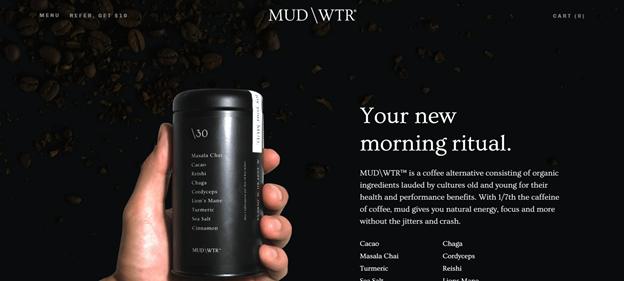
MudWtr
A black background can be overwhelming for many designers but finding the right layout, and contrasting typeface can make it work.
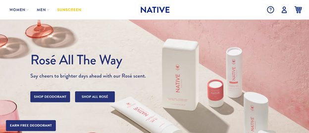
Native
It is impressive how the color palette is so well thought-out. The cohesiveness between the products and the Shopify store is so lovely.
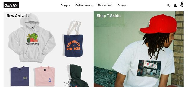
OnlyNY
The layout is very simple and straight-forward.
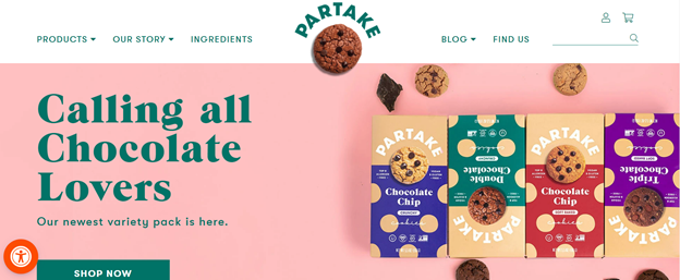
Partake
The cookie logo – no other words to describe the brilliance of this Shopify store.
Pawhuggies
The cute font color and font style just matches the clientele targeted by this Shopify Store.

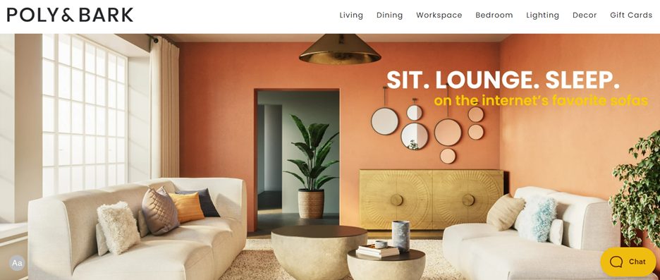
Poly & Bark
An interior design website? A website for buying homes? Nope, it is a Shopify store for sofas. What better way to market goods that to create images of where and how to use it.
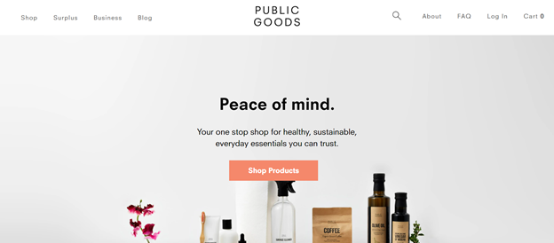
Public Goods
A grey color palette feels so safe and boring, but in this Shopify store they made it look so luxurious. It also makes the store experience very relaxing.
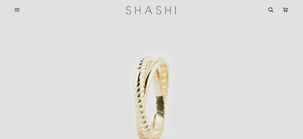
Shashi
The simplicity of the layout brought out the luxury of the products.
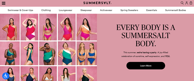
SummerSalt
Design is not just on the color palette or the theme, sometimes it is on the images used in the website. This Shopify store employed models of a variety of shape, race, age, and maybe gender. Relatability is one huge marketing tactic that a lot of brands forget.
The Man Company
The idea of this Shopify store is so cool catering to men for skincare. You may think it looks like a restaurant or a grocery store, but it ain’t. There are not a lot of skin care lines for men, the idea itself is what makes it brilliant.

Triangl
The backgrounds used in this Shopify store with the magazine-layout of luscious blue beaches just make you want to buy a bikini and go on a holiday.

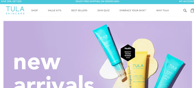
Tula Skincare
Bright purple, yellow, and aquamarine – who knew right?
Also read: 15 Jokes Only Web Designers and Developers Will Get
The post 24 Brilliant Shopify Store Designs


