Adding texture in web design is not as common now as it was a decade ago. More designers prefer using solid, bold colors for minimalism and simplicity, nowadays. However, there are times when using texture as a background adds boldness to a website that could turn a simple page into an outstanding piece of artwork.
Here are some examples for inspiration:
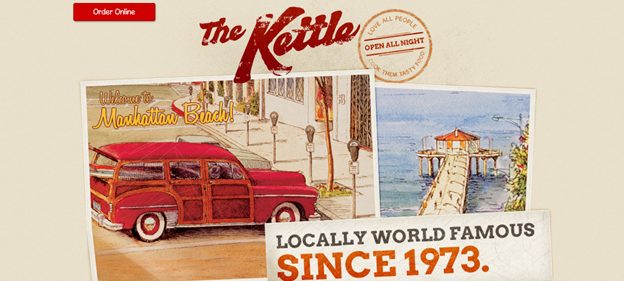
#1 The Kettle
The website has a vintage inspired texture and color, complete with a faded, spray-paint typography style. Design elements like photographs and stamps also complete the overall vintage look.

#2 Free people
The addition of graphics designed as dried flowers and leaves gives an authentic, and unique texture to the website. The graphics is also added simply to the banners.

#3 Uinta Brewing
The wild contrast of colors add a really cool texture to the website.

#4 Jarritos
Comic book styled graphics on a paper textured background gives a outstanding look to the website.

#5 Green Mustache
The scattered munchies make the background look like a photograph taken from someone’s kitchen. It surely makes anyone crave the snack even more.

#6 The Gigi
The crosshair design on the background is a minimalist take on adding textures to websites.

#7 Mony’s
The webpage design makes you imagine the texture of freshly drawn chalk on a rough chalkboard. The fading style of the graphics gives it a more authentic look.

#8 Friendly Projects
The grid-paper style of the background is a simple touch but gives the page a special industrial look.

#9 Koox
The two-color palette on top of the textured background is a plain but luxurious design style.

#10 Marcia & Maro
The luxury paper background works wonders for any top-scale fashion website like Marcia and Maro.

#11 Symbio
The finished concrete look is a great take on industrial styling.

#12 Eat The Ordinary
It may look plain, but the tiny specks of “dust” on the background will make any detail-oriented designer smile with glee.

#13 Armat Drinks
The background may not look like it, but it is actually designed like snow on the ground. The whiteness of snow gives great contrast to rich colors like the royal blue used in this page.

#14 Marie Gillaumet
The background, the typography, and the icon design works so very well together. The page itself is a good addition to any web designer’s portfolio.

#15 Style Tiles
How else can you design a tile website than with a grid paper background?

#16 Retour a Zero
The randomness of the background texture does not overwhelm the intensity of the main typography. If anything, it enhances the boldness of the design.

#17 Into the Zombie World
The background looks like a cross between a photo and an oil-based painting. Anyone could feel the brushmarks just by looking.

#18 Marketplace
Wood backgrounds is a very common background texture.

#19 Maquina Kryptos
It is very bold to use leather as a background texture and in this color, it subtly works.

#20 Jam 3
Photocollages also work great in adding texture to any background.

The post 20 Inspiring Examples Of Texture In Web Design appeared first on SpyreStudios.


