Progress indicators, or also known as progress bars, are normally added to a website or a page to show the status of ‘ongoing processes’. Progress bar UI designs and their uses can be best illustrated via examples and this post will show you exactly that.
Now, depending on a website, the processes shown by the progress bars may vary. We normally see these progress indicators when uploading or downloading media, images, or any form of data. Another way of finding a progress indicator is when a page is loading or in the process of retrieving information. The use of progress bars has expanded more in recent years. Now, users can see these progress bars when signing up for a website or subscription. It is also normally seen when tracking deliveries, online purchases, and the like.
Basically, progress indicator UI can be divided into these five standard designs. Each kind of design has its own pros and cons and deciding which to use will depend on purpose and preference. Nonetheless, web design has improved drastically when it comes to designing elements as basic as progress bars.
Horizontal bars
When we think about a progress bar, we usually think that it is designed horizontally. Loading bars, progress updates, and the like are normally shown horizontally.
Vertical bars
Just like the horizontal design, a vertical progress bar is also a standard method in showing progress linearly. If you are trying to show information in multiple stages or levels, it is best to use vertical bars as it is more common for users to scroll up and down rather than left and right.
Circular designs
These are more commonly used for ‘loading’ or ‘updating’. Sometimes, designers may refer to this as “loading spinners” as it literally spins while retrieving information for your website. A lot of times, these are used when progress has an indeterminate amount of ‘loading time’. There are more unique ways of presenting this, and nowadays, designers prefer using animations.
Animated bars
Why use animated bars? It takes the mind of the users away from how slow the process really is taking. Remember, loading times in a website affects its traffic.
3D bars
If you are designing a website and really want to take a more unique approach to it, using 3D bars is the way to go.
Here are some of the best examples you could check out when designing progress bars:
Standard progress bars
Horizontal bars with a percentage
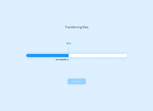
Image source: Vlad Grama @ Dribble
Basic Circular Loading design
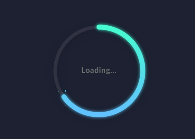
Image Source: Wendy Zhou @ Dribble
Standard vertical progress bars
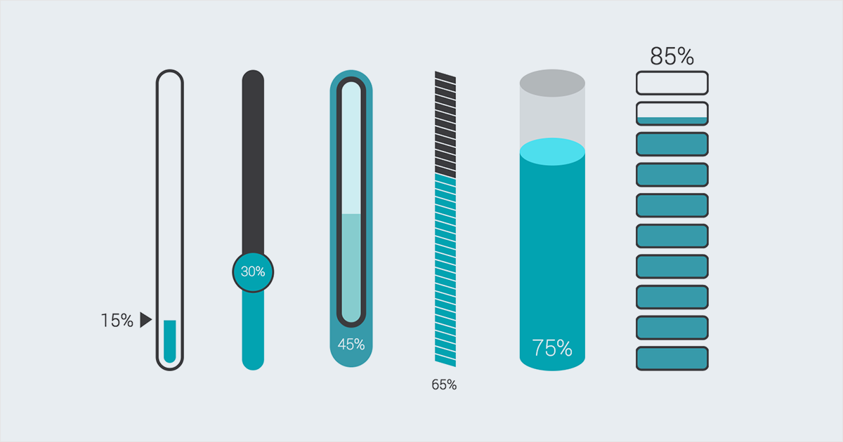
Image Source: Visme
Progress in levels
Showing highlights of stages
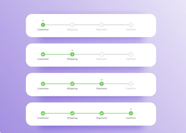
Image Source: Alexander Mochalov @ Dribble
Vertical and no lines
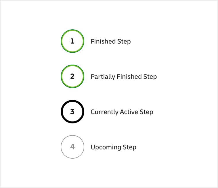
Image Source: DHL
Animation and progress bars
Looped loading
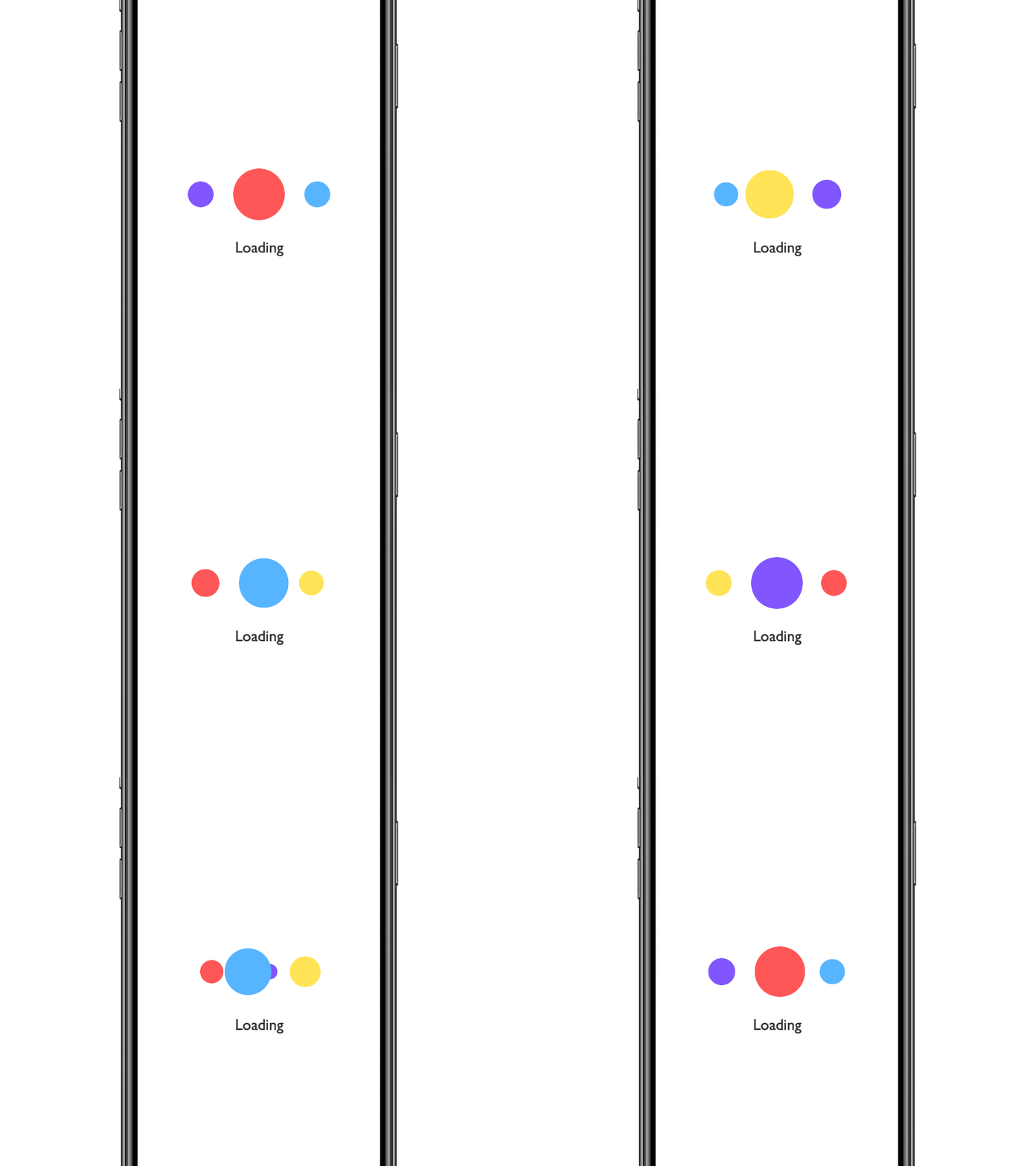
Animated uploading by Kevin Jones

Simple loading animation

Tick Tock loader
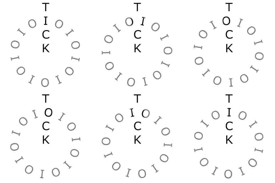
For deliveries and e-commerce sites
Order tracking
Image Source: Pinterest
Minimalist and Dual toned
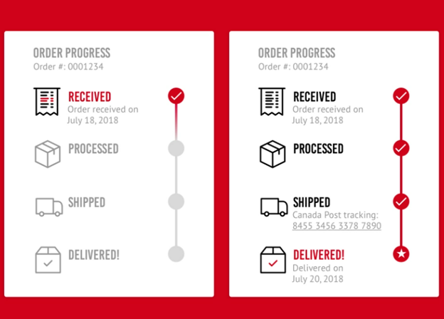
Image Source: Nancy Huyn @ Dribble
Simple Horizontal Design
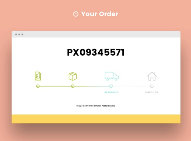
Image Source: Kelsey Janda @ Dribble
Progress bars in 3D
Neon Green progress bar
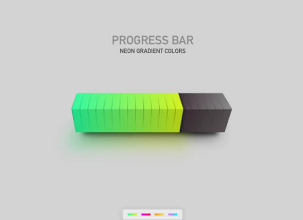
Image source: Pramod Kabadi @ Dribble
The post 13 Progress Bar UI Design Examples


