Staying fit these days is now more important than ever with the global pandemic having no cure or vaccine yet other than a healthy body. It just so happens that being active is also more difficult because gyms are closed in affected areas. Home workouts like yoga, in that regard, are golden and yoga website designs are paramount in keeping people’s interests.
Now, if you’re a website developer and you’re setting up a yoga website for a client or if you just want your own inspiration for reference, then yoga website designs from the industry leaders should help you greatly. They are tried and tested site layouts and formats that can surely keep the visitors’ interests and make them invested in yoga.
Below are some of these industry leaders and their yoga website designs so you can check for yourself how it’s done. In the same process, you can also help a lot of people stay fit and ward off diseases.
Margherita Dal Pra

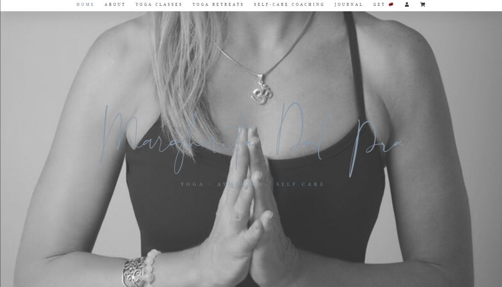
Margherita Dal Pra’s website is called YogaM where the homepage will surprise you with a tranquil monochromatic picture of one of her poses. All the functional user interface elements are at the top where you can navigate to the different sections of the site. You can also scroll down a bit and see her website’s words and goals.
Kristen McGee

Kristen McGee’s website sports a more energetic look and makes it appear like she’s a more active yoga teacher. One notable thing about her site’s homepage is the scrolling list of media-oriented accolades at the bottom where all her appearances are documented. Scrolling further down will reveal information as well as popups for some of her products.
Elena Brower

If you prefer a more artsy and calmer appearance, then Elena Brower’s website might be a prime inspiration for that. Her website is not just for yoga but also mediation and some of her podcasts. You can certainly feel the love Elena put into her website with all the vibrant watercolor smudges of her website’s front page.
Dylan Werner

Being one of the few male yoga teachers on this list, Dylan Werner makes his website more distinct with a simple style that doesn’t have as much flair as the other ones. He makes up for by being direct, however. As soon as you enter his website, you’re immediately greeted with an email list signup without needing to scroll or click anywhere else, making the experience more personal.
Yee Yoga

Rodney Yee is also a male yoga teacher whose website is rather minimalistic and tranquil. Right off the bat, he greets you with a smile on his homepage and a classic yoga pose. He also hosts free FB Live yoga sessions every Friday, something he announces early on in his website after a bit of scrolling down.
Yoga and Juliet

It’s a foreign language website so not exactly for everyone but Yoga and Juliet’s design philosophy is a good example of how to achieve minimalism without denying visitors the important details and soul of the website. Her website immediately opens up with a spiritual video of a yoga pose in a perfect nature background.
Power Yoga

Just as pictures convey better than text, so too does video convey better than images. Power Yoga understands this well enough and makes its homepage an attention-grabbing video of one of their yoga classes featuring dozens of students. It shows just how fun you can have when you join their sessions and the joining options are easily recognizable at the top.
Gypset Goddess

Gypset Goddess is primarily a lifestyle blog for adventurous people looking to expand their horizons. It still does dabble in yoga teaching and certainly has classes though not as thorough as the more dedicated websites here. Anyway, the website’s scrolling photo gallery at the front will surely convey what this yoga teacher is all about.
Hamsa Yoga Studio

Modern wouldn’t begin to describe Hamsa Yoga Studio’s style. It’s one of the more unique and oddly satisfying layouts and themes on this list. It’s all about cramming as much functionality in a one-page website without making it bloated and the result is a stunning contemporary design that would please even art students and professors.
Yogaia

Speaking of modern website designs, Yogaia is something that won’t fall back far behind. It’s an impressive domain with no topbar, making it more aesthetically pleasing and peculiar than most sites. It also voices out the pricing and what to expect within a class right away so that the visitors don’t have to keep wondering.
YogaVibes

When it comes to transition styles and introduction of new elements in a page, YogaVibes does it with flying colors. Apart from featuring a video on its homepage, YogaVibes also makes other page elements slide in stylishly and seamlessly. They also have great vector art which is probably why they chose to add those effects.
YogaToday

YogaToday does everything right in the user experience playbook from fast loading to easily accessible navigation options. Moreover, it prioritizes elements of its website well enough and introduces visitors to its video archives early on so they can see what the website is all about. They also have a category for different goals and motivations to keep you organized.
RELATED: 12 Best Health Website Designs
The post 12 Yoga Website Designs for Inspiration appeared first on SpyreStudios.


