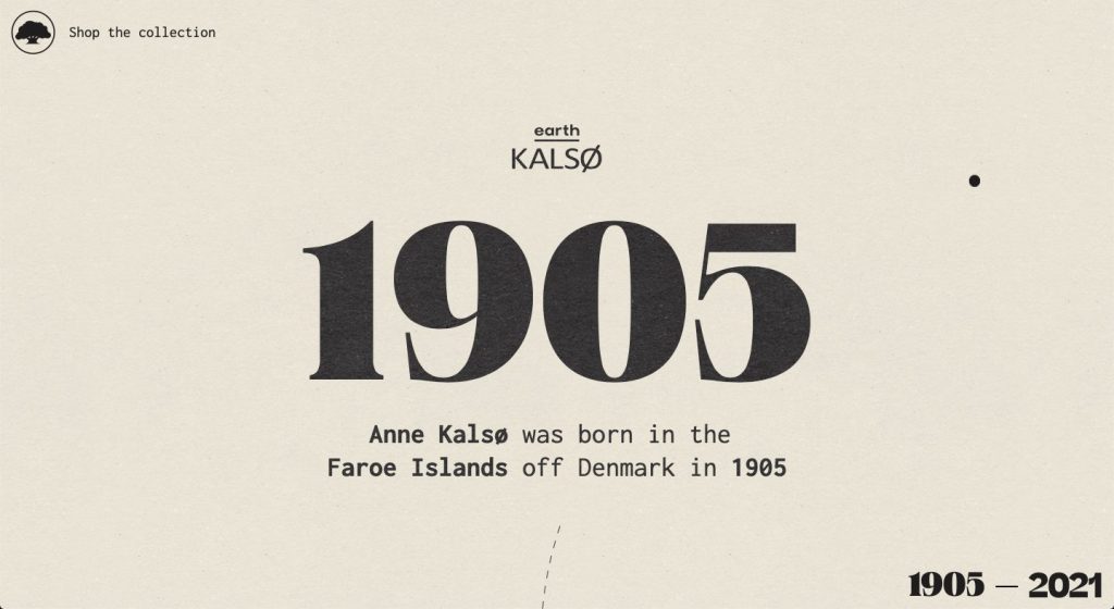
The retro style has once again overtaken the design industry for its elegant look and timeless feel. Creating a retro website is much harder than designing a site with a minimalist look as it requires the placement of a lot more additional elements than what we’re used to. Retro websites often end up looking cluttered but that’s not the case with these 10 gorgeous examples we’re about to show you.
Retro & Vintage Web Design Inspiration
See why these gorgeous websites have taken the first positions in our list and get inspired with our hand-picked collection of retro web designs.
01: Kalso
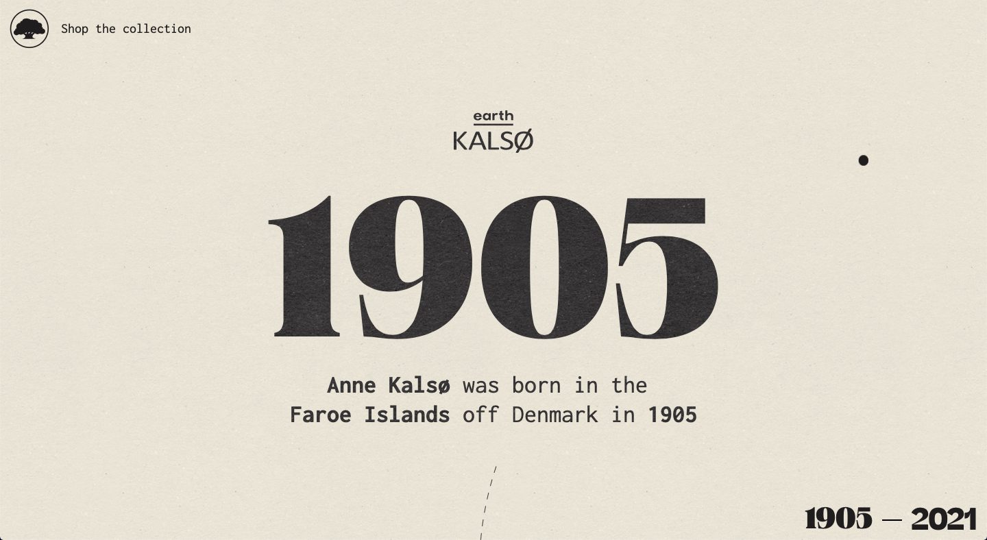
It’s pretty challenging to create a retro-themed website that also looks minimal but Kalso was able to accomplish this task, as can be seen from their website. It looks clean and minimalist but still feels retro based on its look.
02: Dollar Dreadful
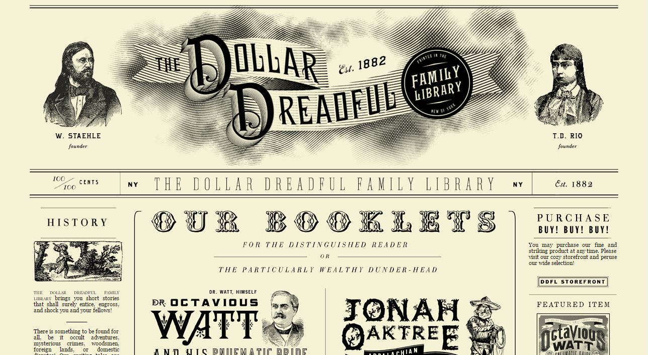
The design of Dollar Dreadful Family Library resembles an old newspaper. The hand-drawn images and ornamented typography create a timeless look that perfectly matches the website’s idea.
03: Frugaa
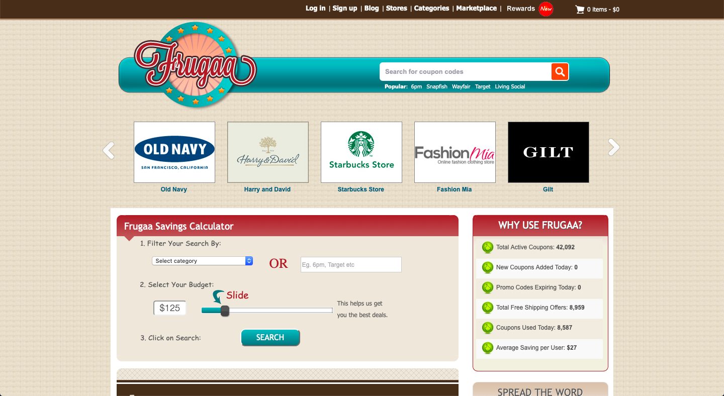
This lovely deals website has an eye-candy design with a retro look that quickly grabs viewers’ attention. The dark red color creates an accent in the design and the mint and beige colors give the site a vintage feel.
04: The Longest Road Out
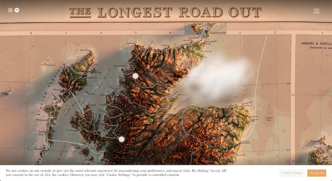
Nothing says vintage or retro than an old map that people used to carry around for navigation. While we no longer see or use such maps today, The Longest Road Out depicts an old map with 3D effects that just feels like the old times.
05: Anita Gelato
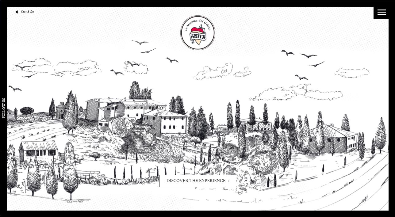
This gorgeous website has a great parallax background that uses different sketched elements to create a beautiful country landscape. The slider design of Anita Gelato speaks of tradition and the Instagram-filtered photos in the ice cream gallery give the site a rather contemporary look.
06: Radio New York Moon
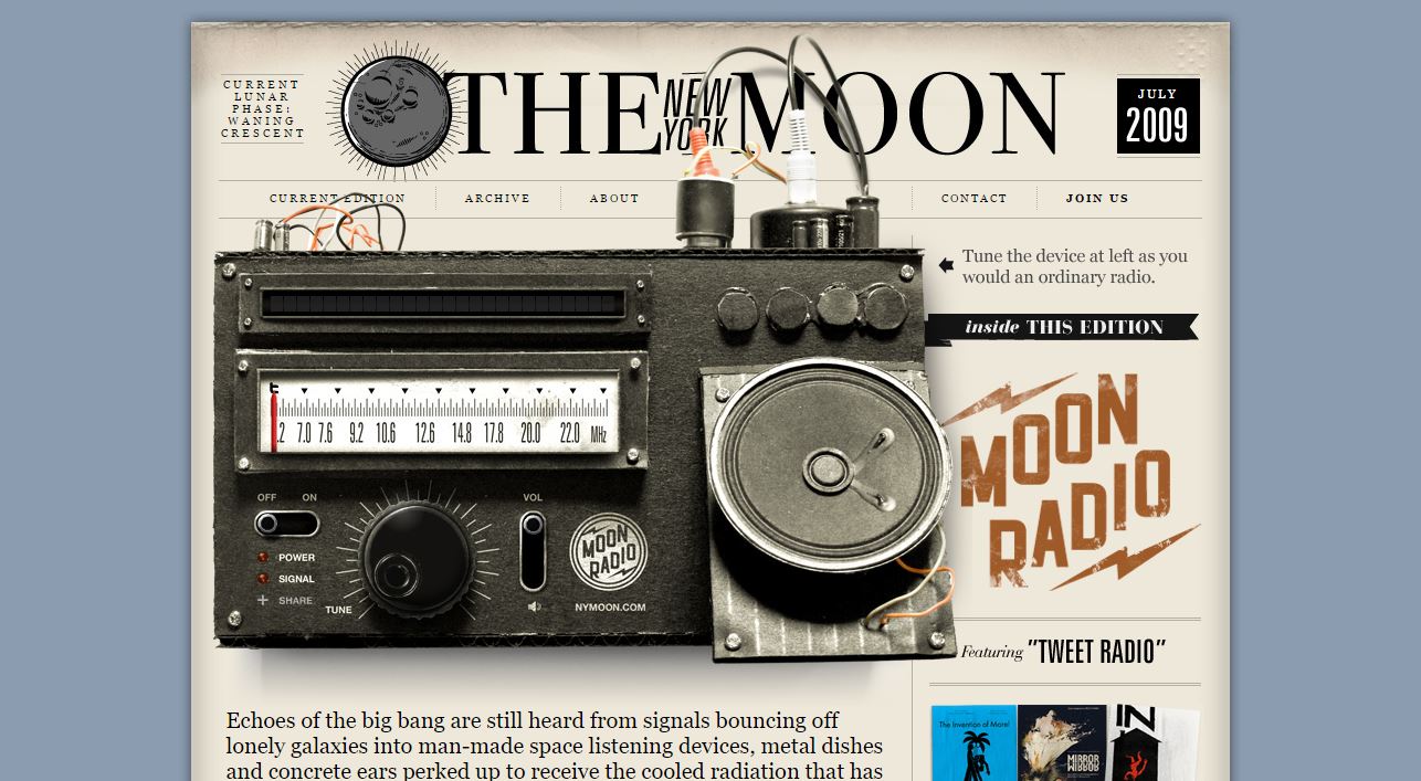
The website design of The New York Moon radio uses various retro elements and imagery that match the style of the radio. The vintage radio, placed above the fold, is an interactive image with an integrated playlist that quickly attracts the visitors’ attention.
07: Cycles Gladiator
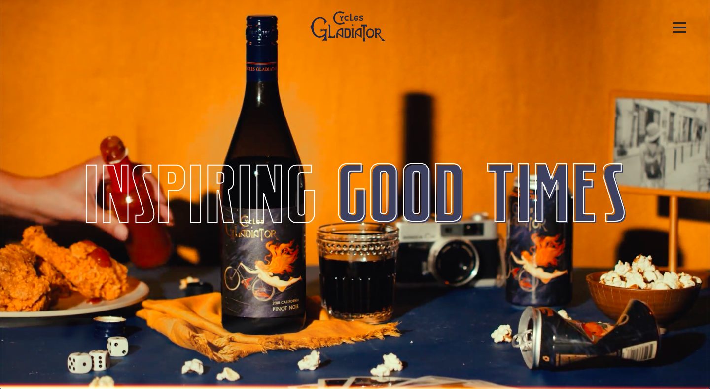
Retro can be either all shades of brown or pops of color here and there. Cycles Gladiator obviously went for the latter and look how it turned out! The website just pops and grabs the attention of the audience while still maintaining that retro feel.
08: Dayln. Design
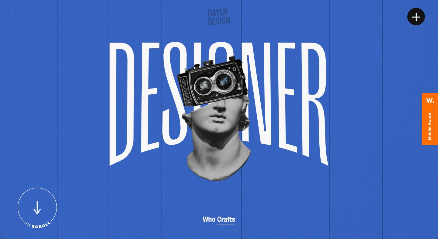
While some people may argue that this isn’t retro at all because of the color base, one begs to differ. Dayln. Design incorporates a modern perspective and design in its website but attaches some retro elements like the old camera and the font at the center of the page. It’s a refreshing and unique take on what retro should look like.
09: TN Vacation
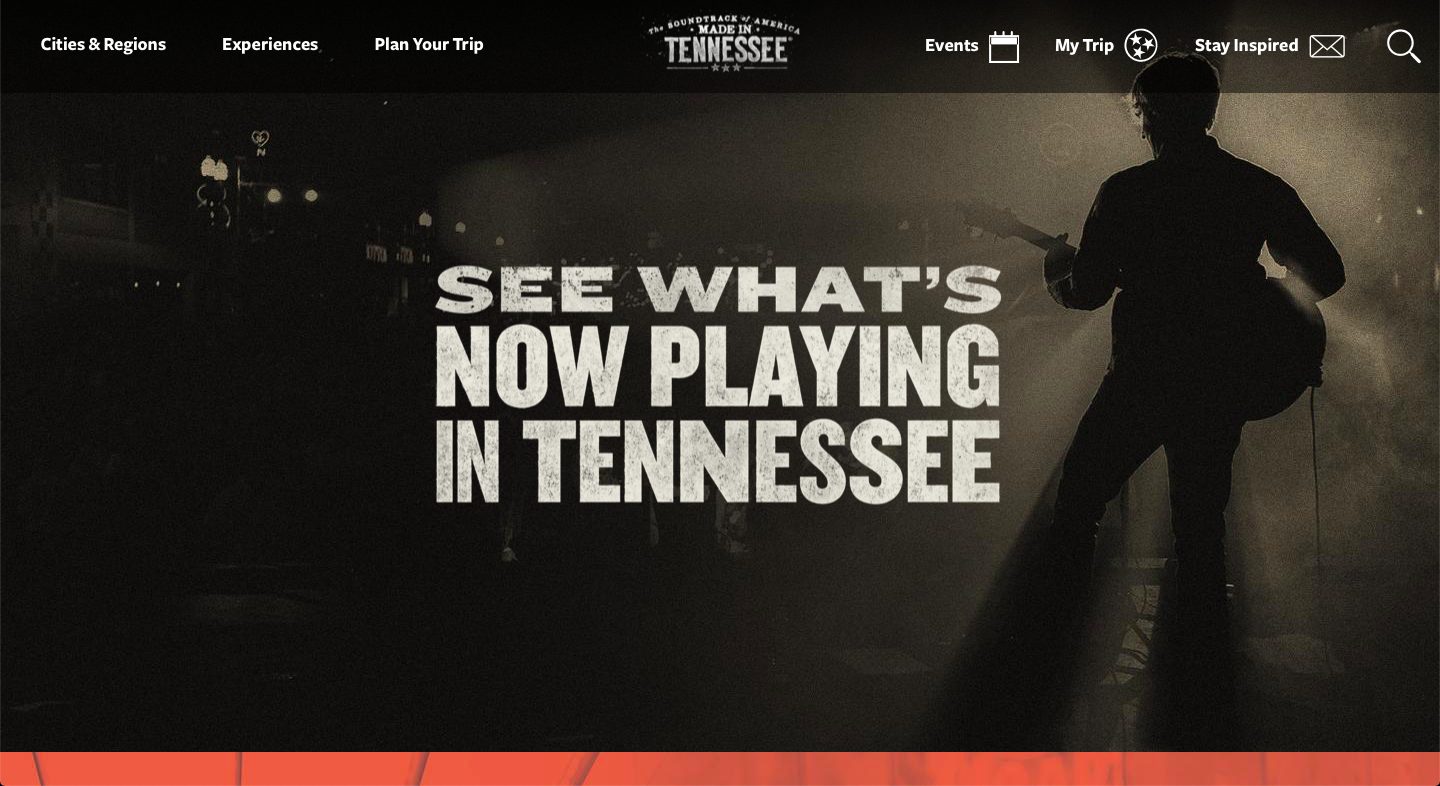
The Tennessee Vacation website allows visitors to explore a long list of places, events, and activities that take place in Tennessee. The site has a beautiful retro design that combines different shades of red, blue, and beige.
10: Antique Piano Shop
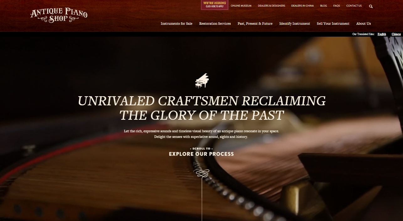
The Antique Piano Shop website has a gorgeous video background and uses elegant typography with a vintage feel. The dark red menu and the highlighting ornaments in the logo and below the text create a retro look that perfectly matches the website’s main idea.
In Conclusion
Matching color palettes and choosing the right typography plays a crucial role in the design of websites with a retro appearance. We hope this collection of retro and vintage-styled websites has inspired you to create even more awesome designs. We’d love to hear your opinion, so feel free to share your thoughts with us in the comments below.
First published in February 2016; updated November 2021
The post 10 Retro Website Designs to Inspire Your Next Web Project

